Atlas Identity
New visual identity for Atlas - RBC Internal Developer Portal
Role
Senior Product Designer
Timeline
June - July, 2025
Responsibilities
Visual identity package, external coordination
Team
Digital Platform & Engineering, Technology & Operations
RBC’s internal developer portal entered a new chapter — as Atlas. This is the story of how I built a brand identity that my team and I are truly proud of.
“An atlas most commonly means a book or bound collection of maps. The word also refers to a Greek mythological Titan forced to hold up the sky, the top bone in the human neck that supports the head, or a person who carries a heavy burden.”
Atlas now carries the weight of RBC’s entire developer community.
The Thought Process All Together
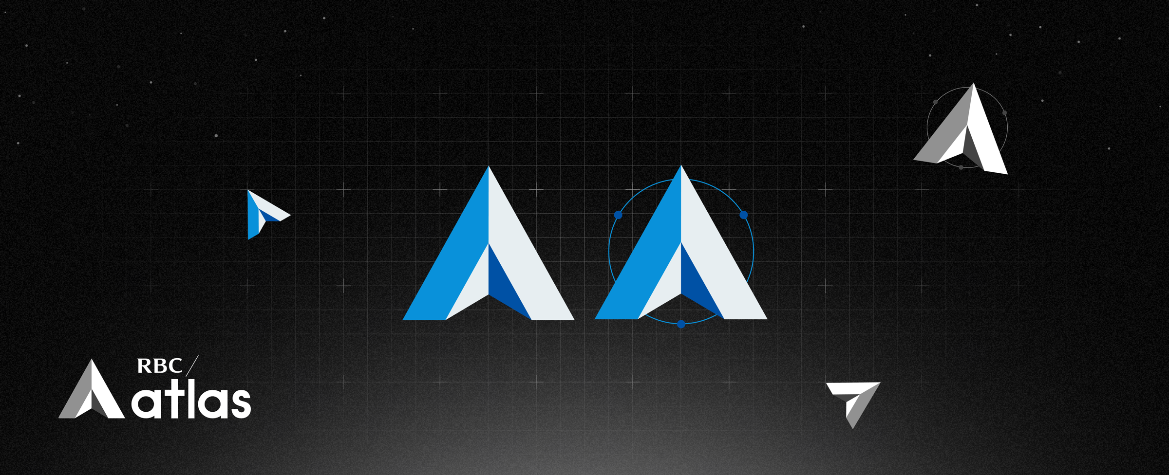
“A”, the Triangle and the North Arrow
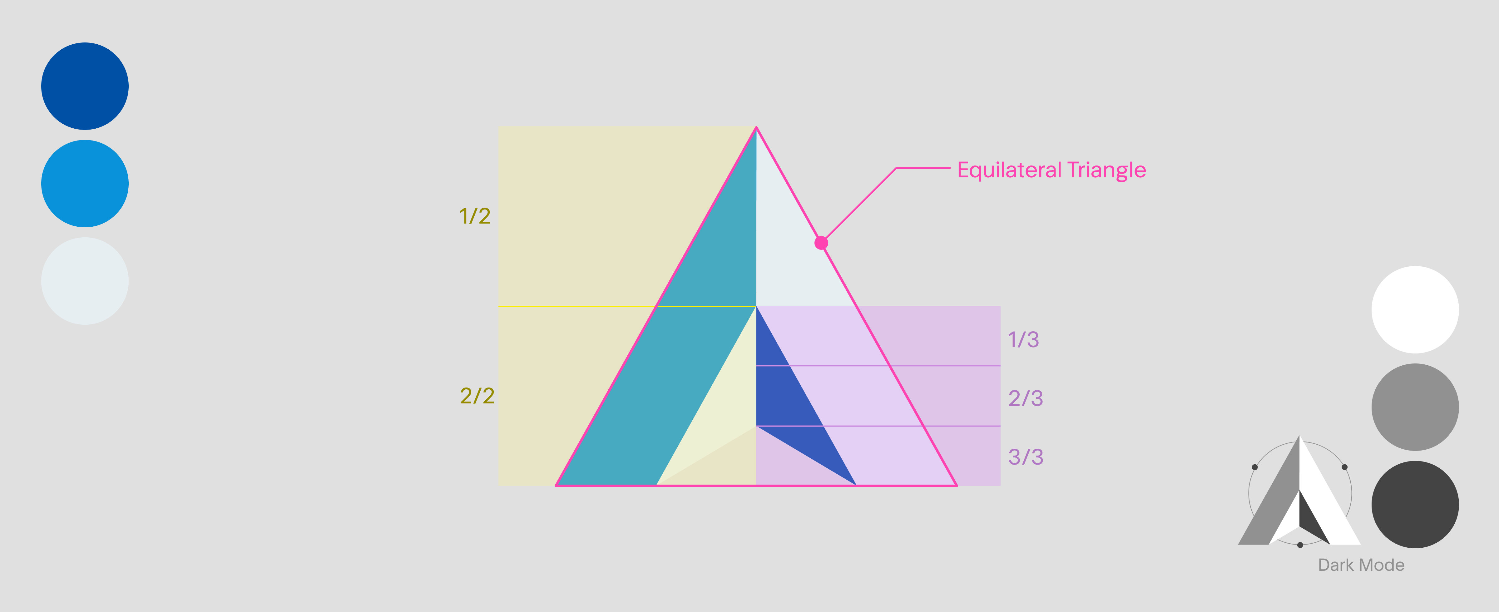
It is obvious that there is an “A” in the triangle, making it a direct and recognizable connection to the brand name. Triangle is a universal symbol of stability, which is a core value and priority for the product. It visually reinforces foundation and reliability we aim to deliver. The North Arrow represents the guidance, that developers will use Atlas as the map.
Symmetry
The symmetry is intentional. It conveys a sense of balance, authority and professionalism. These qualities are essential for establishing trust and credibility, both internally and externally.
3D Blues
Three different shades of RBC blues were selected as the primary colors for the logo. These shades not only align with the brand’s identity but also works together to create a striking contrast. By pairing lighter and darker tones of blue, the design achieves a sense of depth and dimension, giving the triangle a 3D effect on a 2D plane.
The subtle yet impactful technique adds visual interest while maintaining a clean professional look. the use of the RBC blue also reinforces trust, reliability and authority - qualities that are central to both the product and the organization.
Satellite
The Atlas Satellite is the extension of the main logo. The 3 satellite will always orbiting around to observe, study and serve our users and community. The reason why there are 3 of them is because, it creates another triangle in the back. It represents our incredible dev power for both front end and back end in a stable, reliable environment.
Use Cases In Real Life
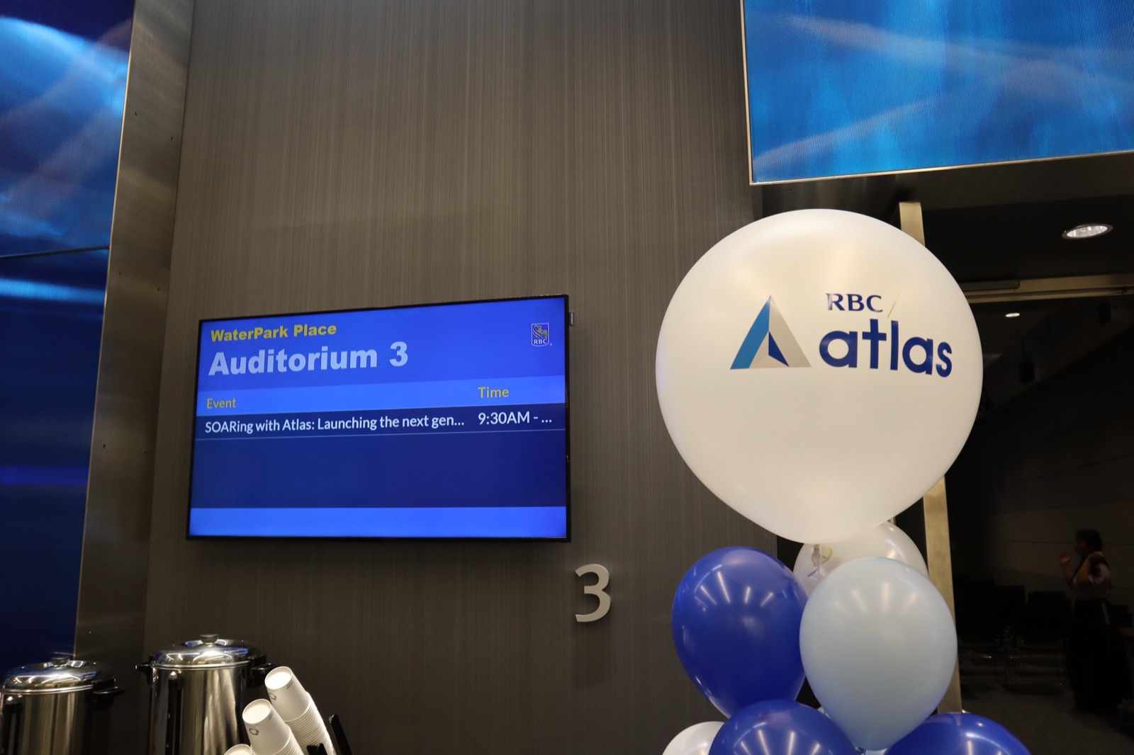
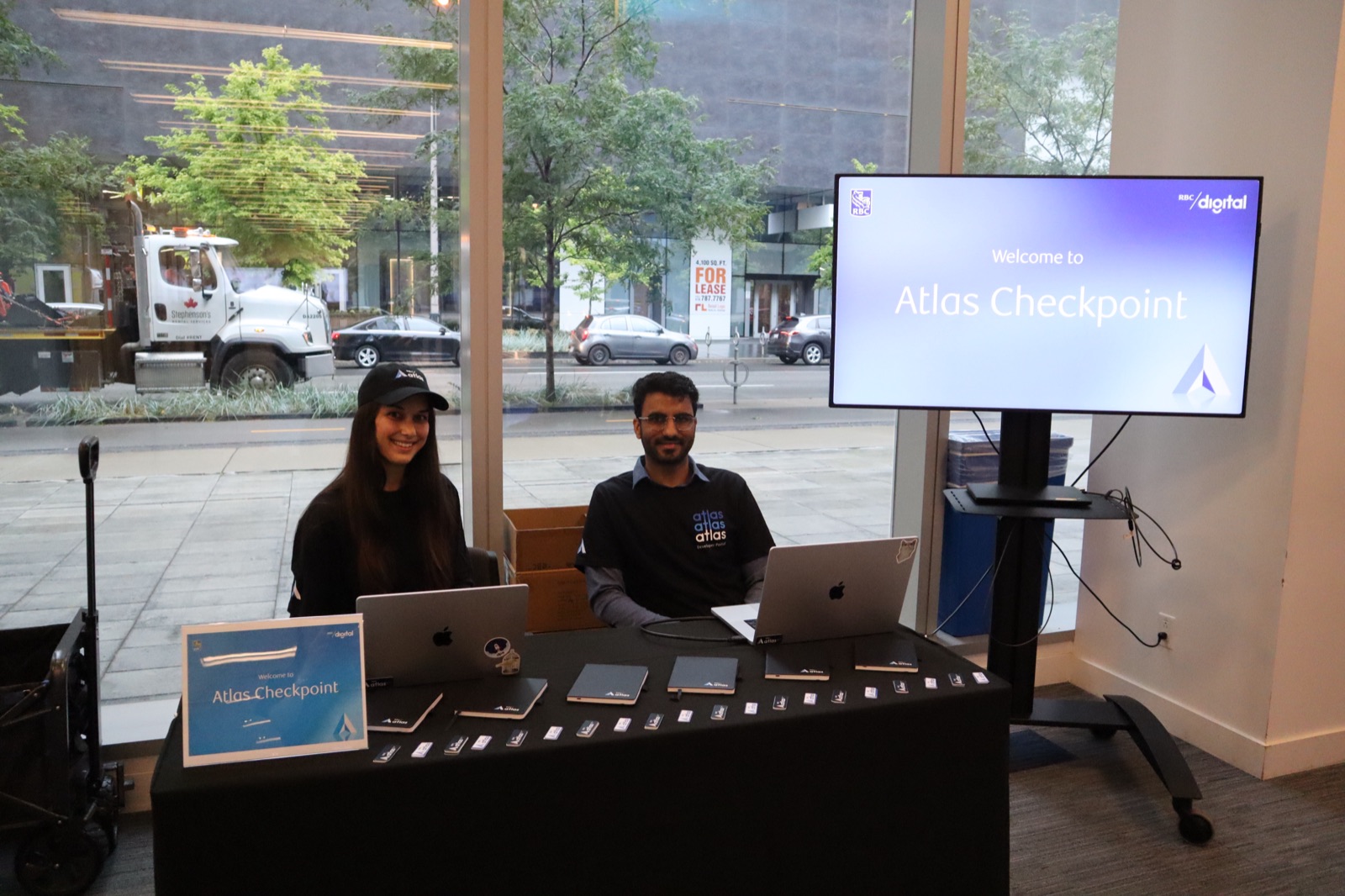
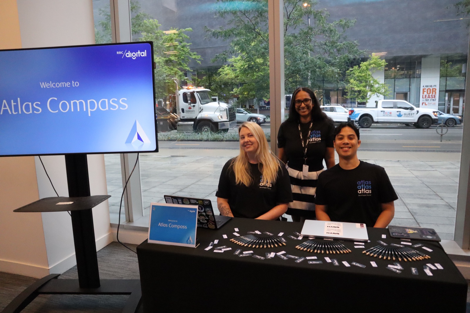
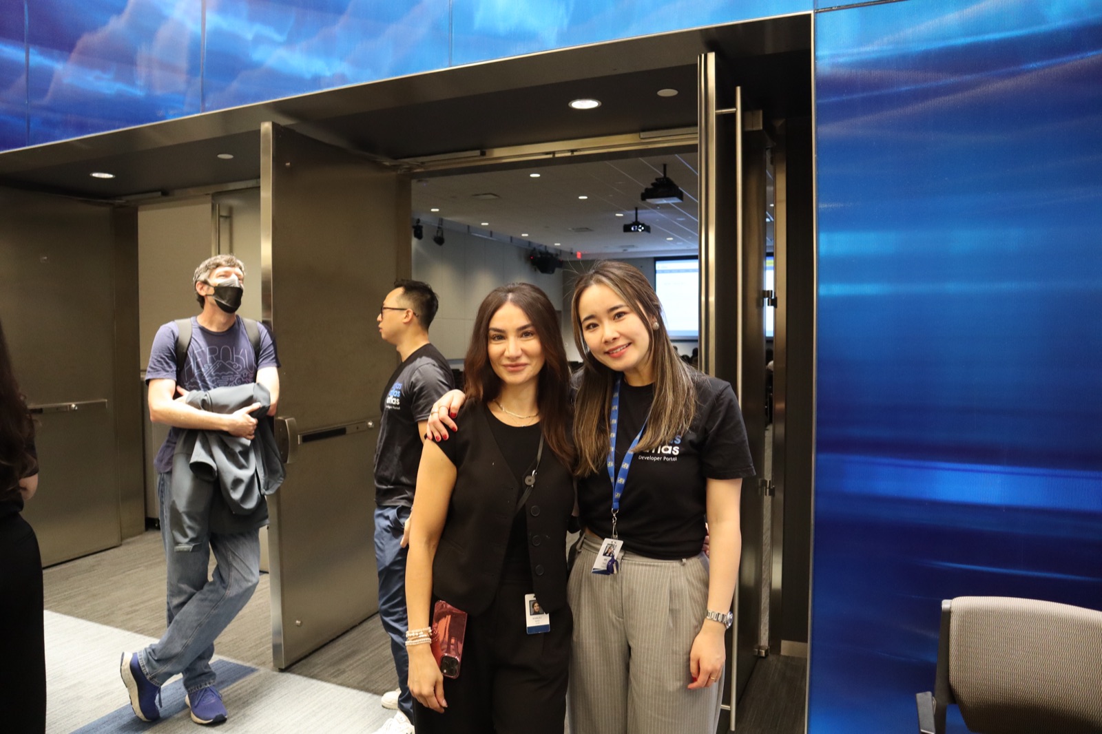
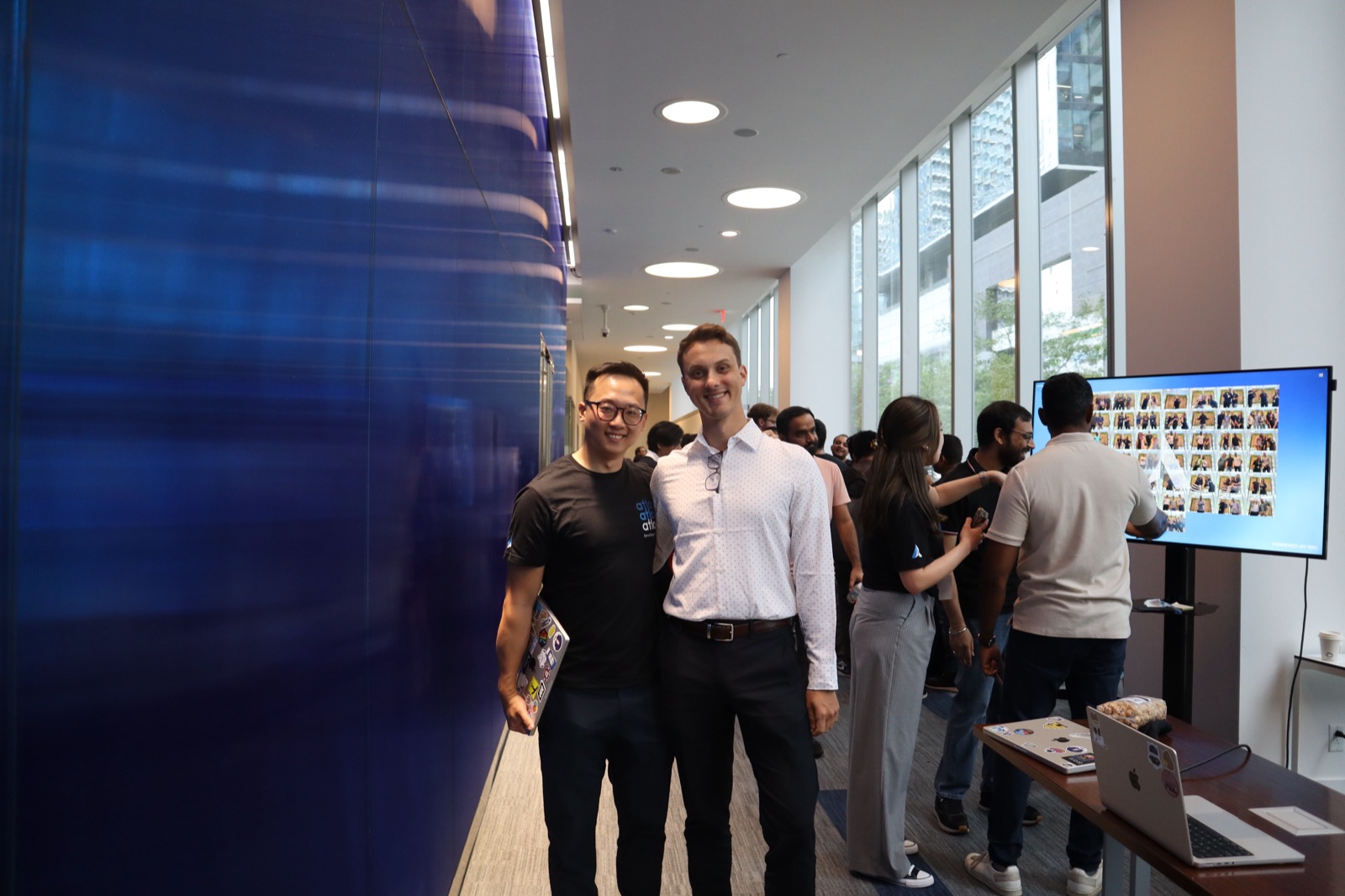
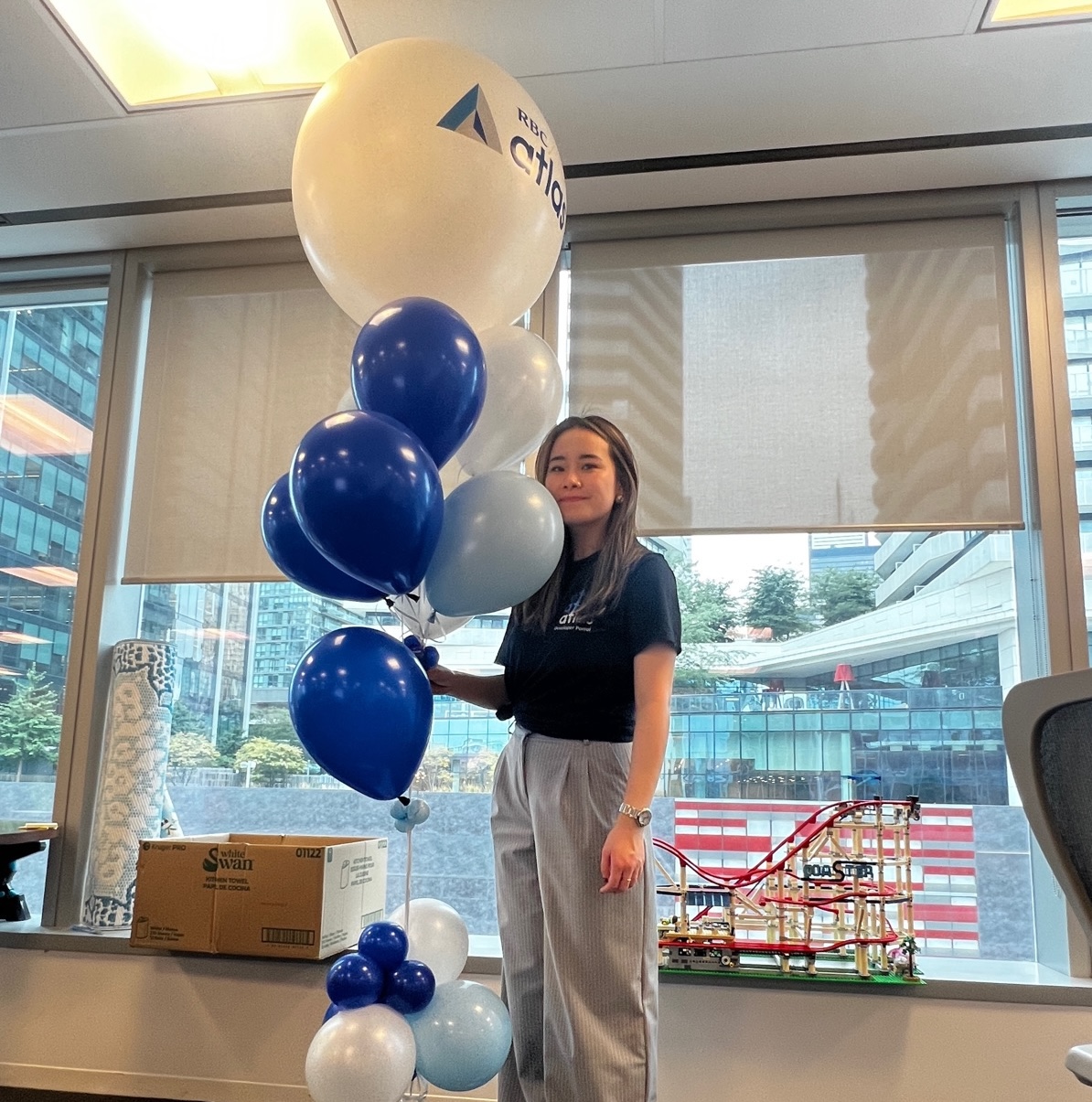
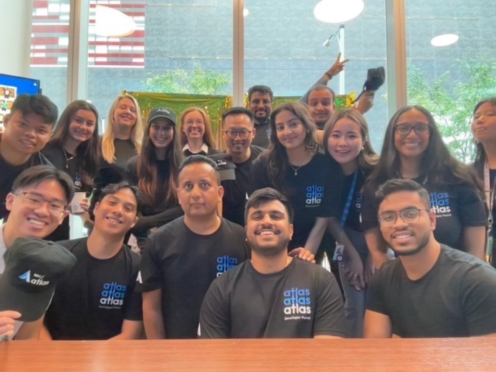
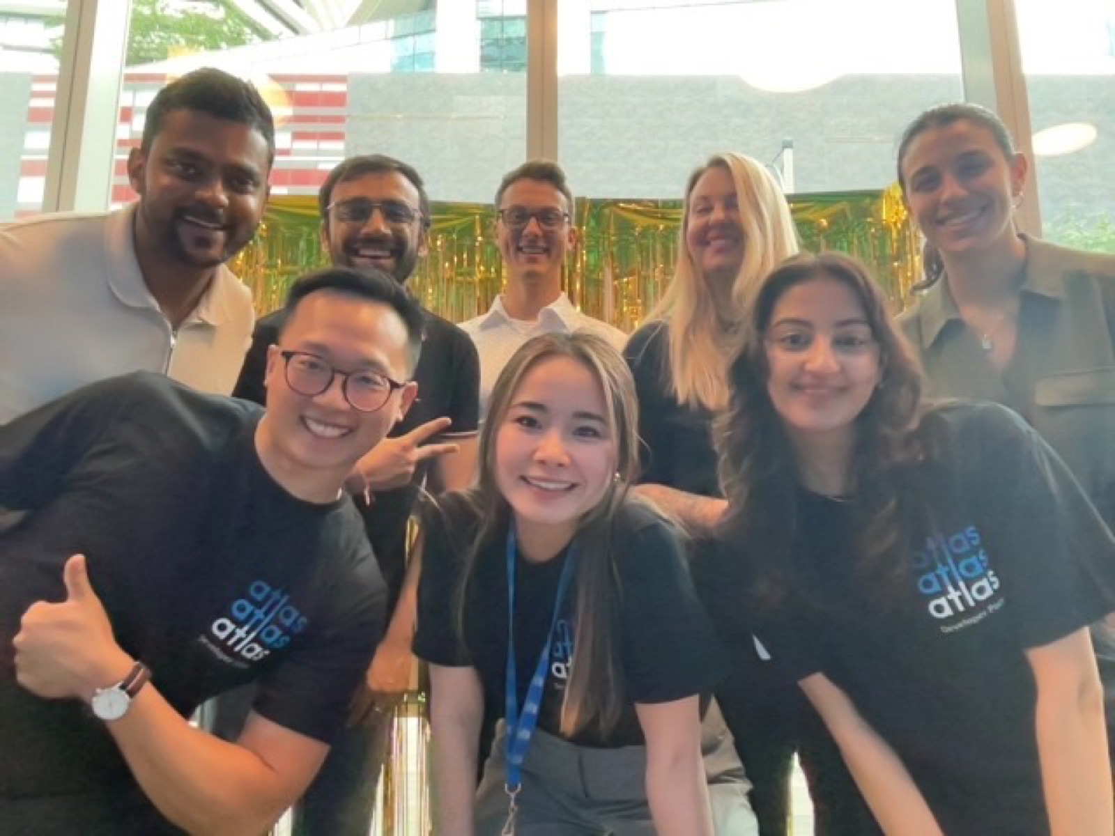
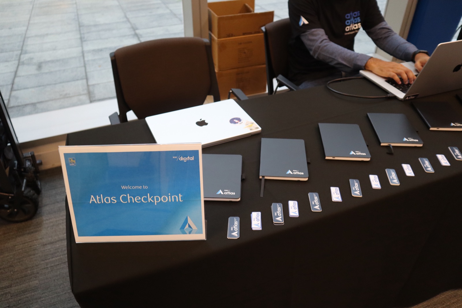
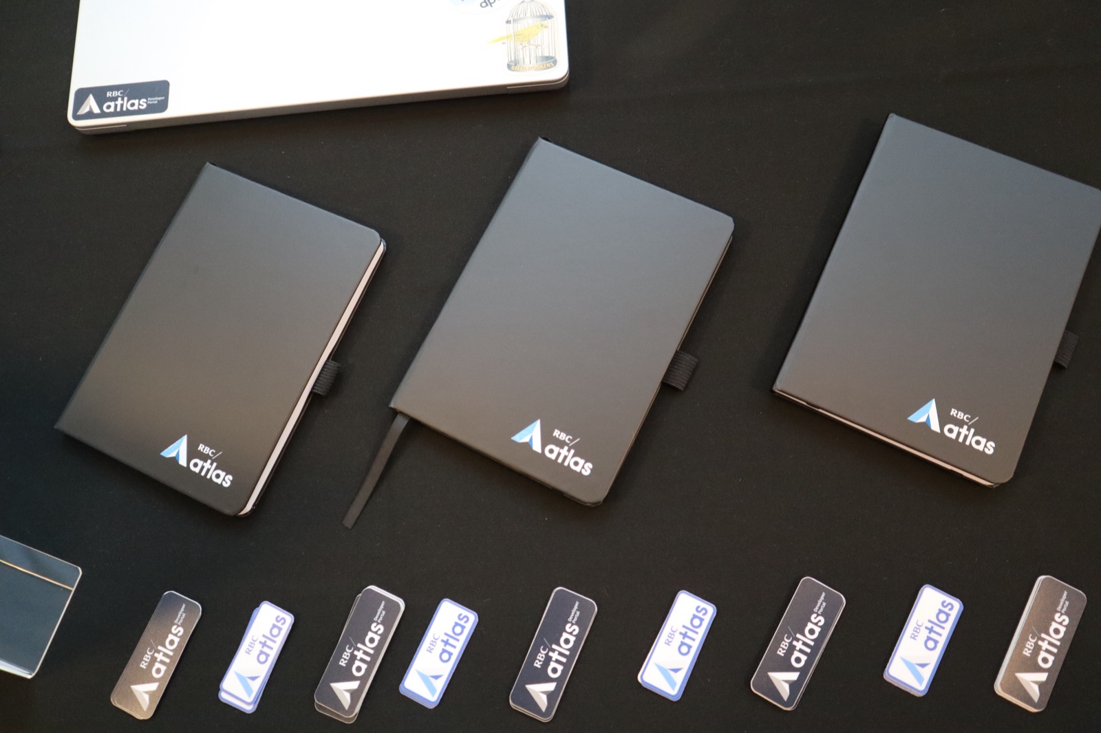
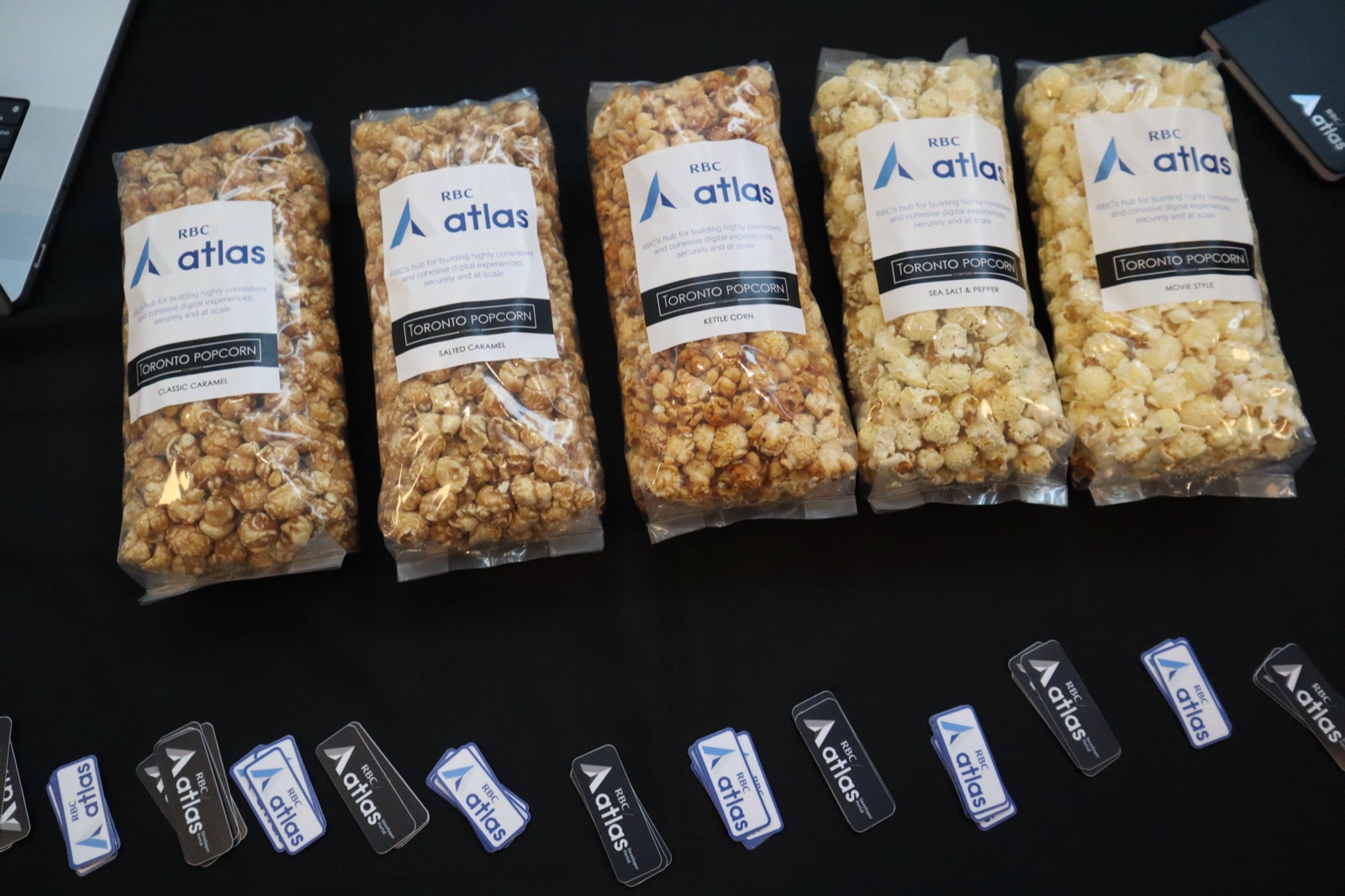
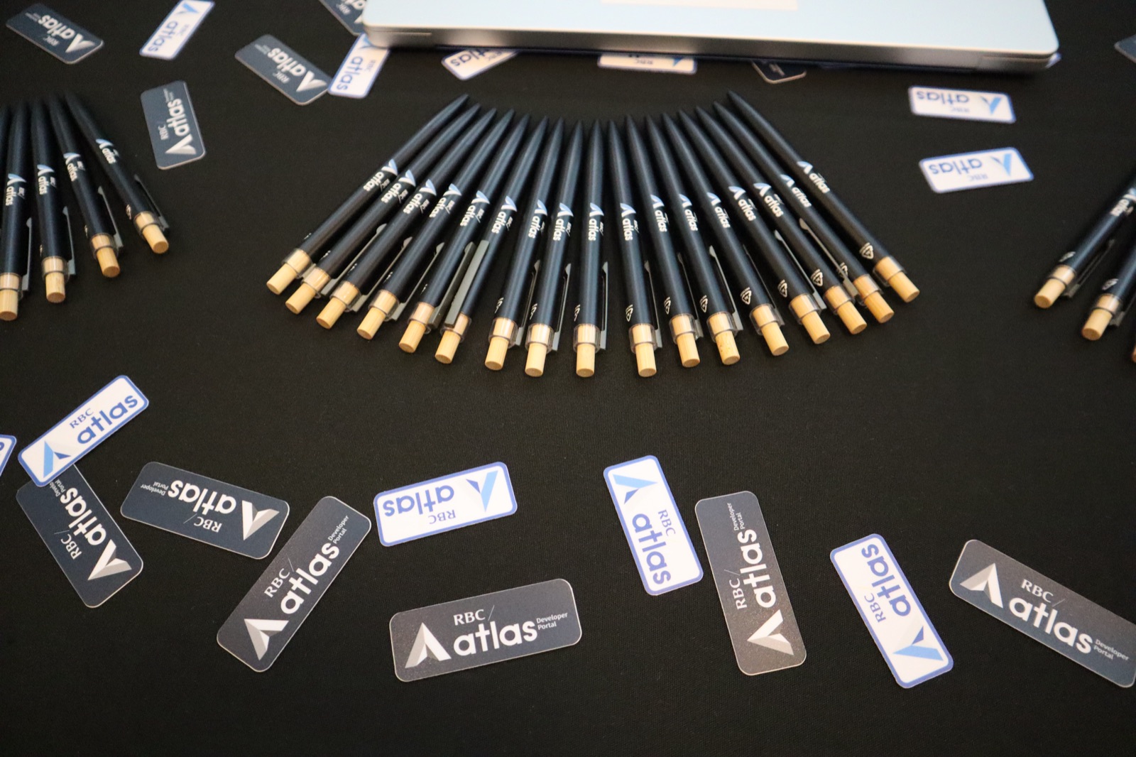
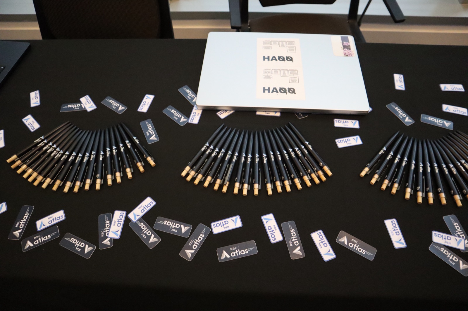
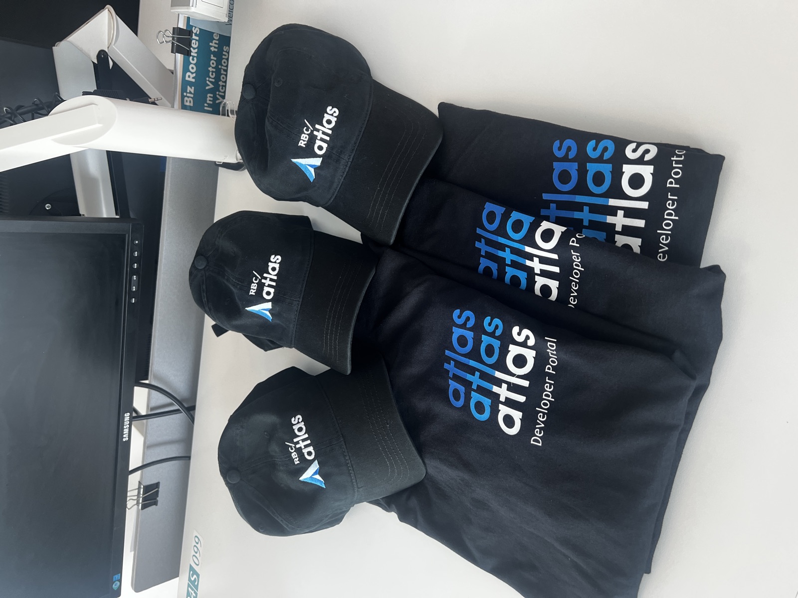
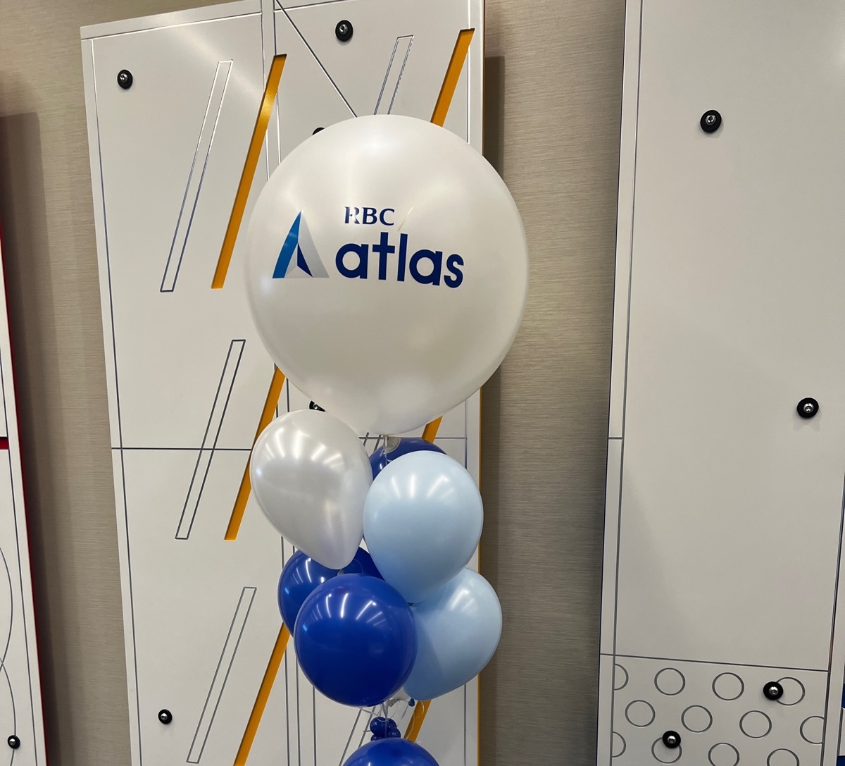
We launched our MVP in August 2025 with a full celebration — balloons and swag filled the RBC auditorium, and we handed out branded merchandise to every guest who came out to celebrate with us.
Seeing the identity come to life at that scale was a proud moment for me as a designer - it held up as a strong, cohesive representative for the product we’d all worked so hard on. The team felt that pride too, seeing our new visual identity out in the world for the first time.