
Wiz Design System
Revamped new theme from B2C to B2B
Role
Product Designer
Client
Wiz Robotics
Timeline
March - June 2024
Responsibilities
From B2C to B2B rapid revamped
To elevate the outdated dashboard of Wiz Partners, I created the B2B version of design system based on the B2C library, to ensure both Wiz Learners and Wiz Partners share the same visual language.
Design Audit
Leverage existing B2C Design System
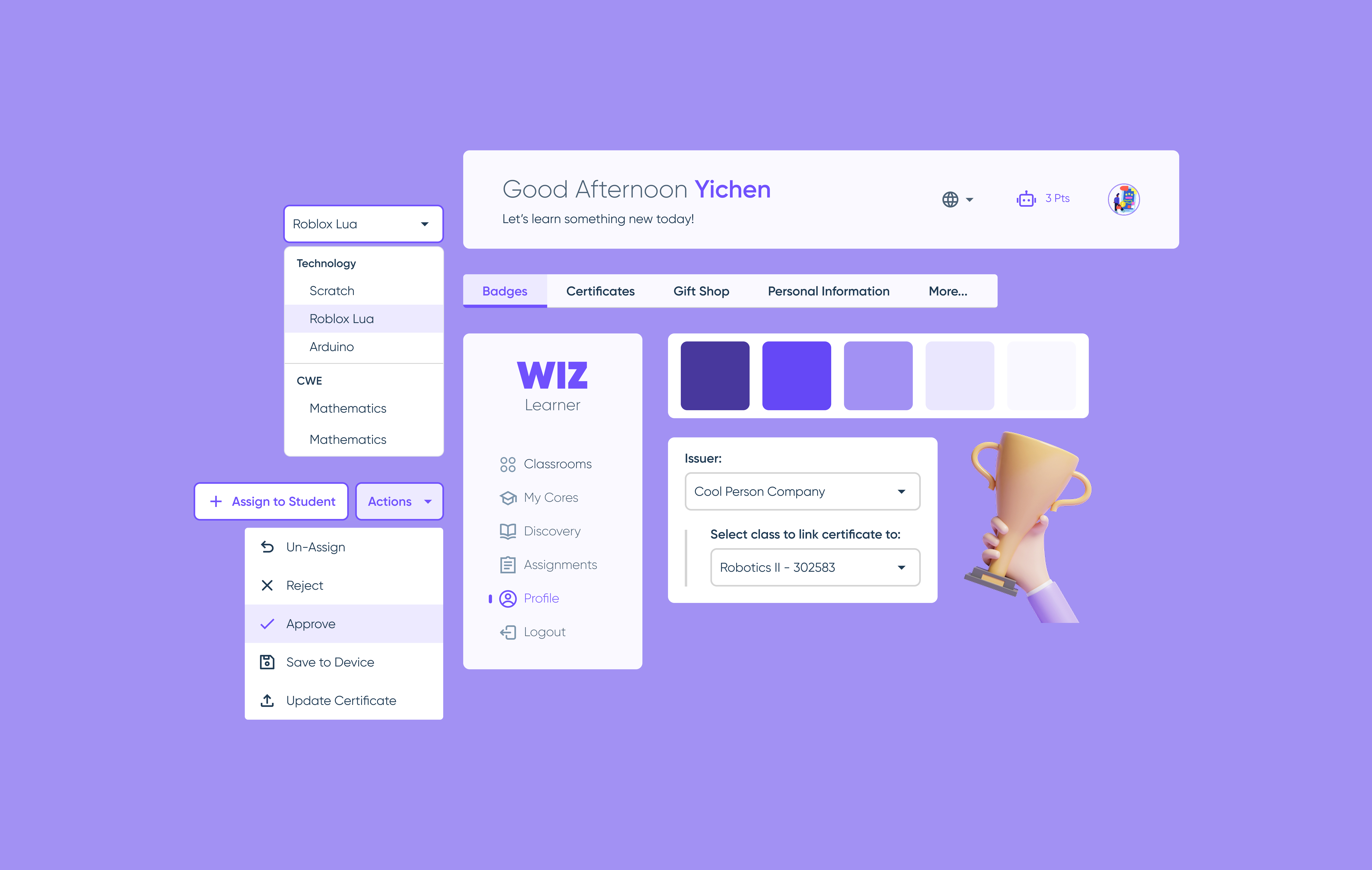
The recently updated product Wiz Learner has a more mature design system for me to leverage. The PM and the owner also expressed that this is the new visual standard and style we are carrying forward.
As the Wiz Learner was designed mainly for students, I was still able to identify elements and components to carry forward for evolvement:
Design Strategy
New Theme, New Strategy
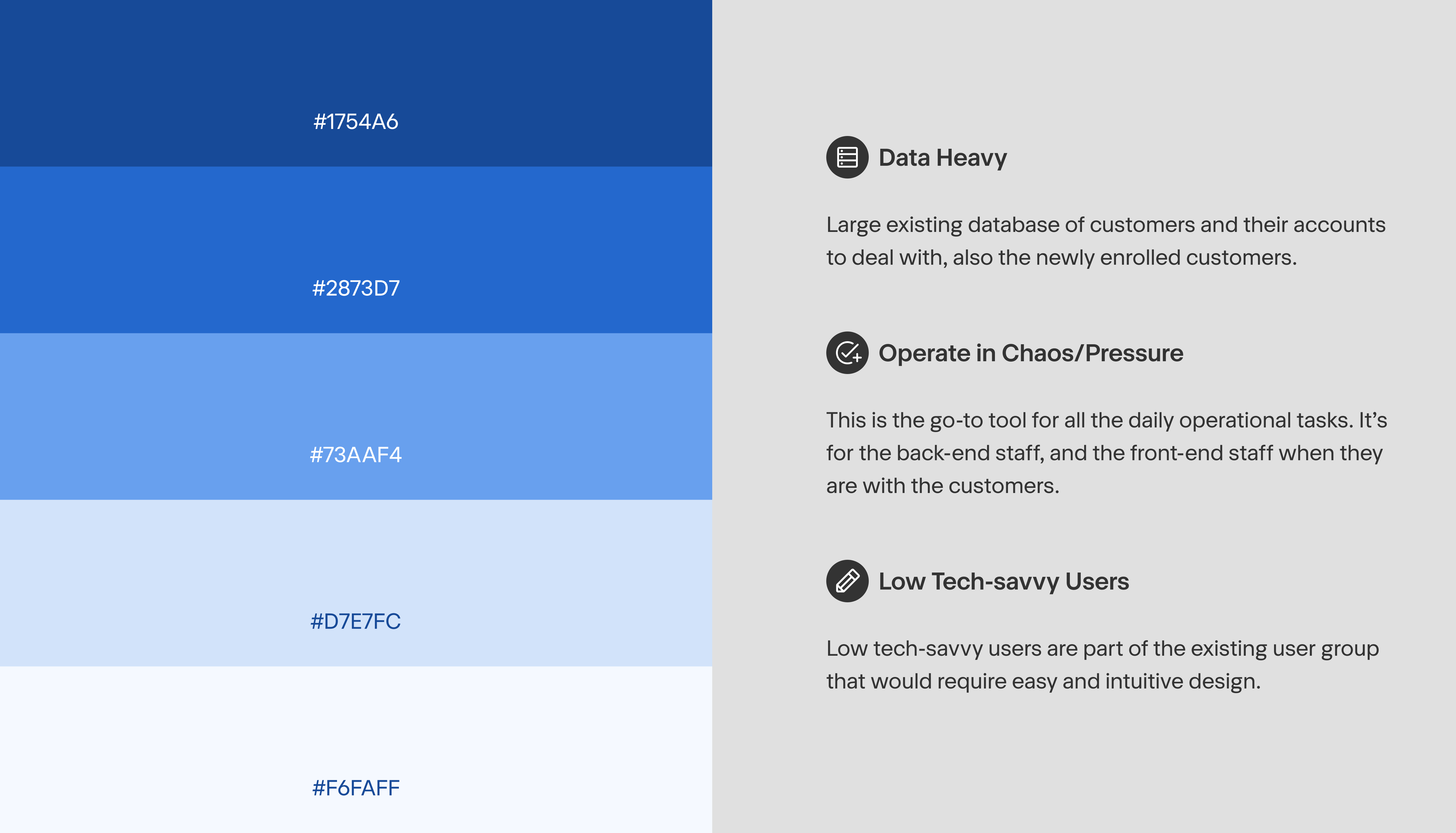
The team decided to use Blue as the new primary color to bring in calmness and professionalism.
The target users for the new product shifted from students to busy admin staff. Based on the interviews with the existing admin team, we learned that it’s important to be mindful of few things.
Design Principles
Define North Star
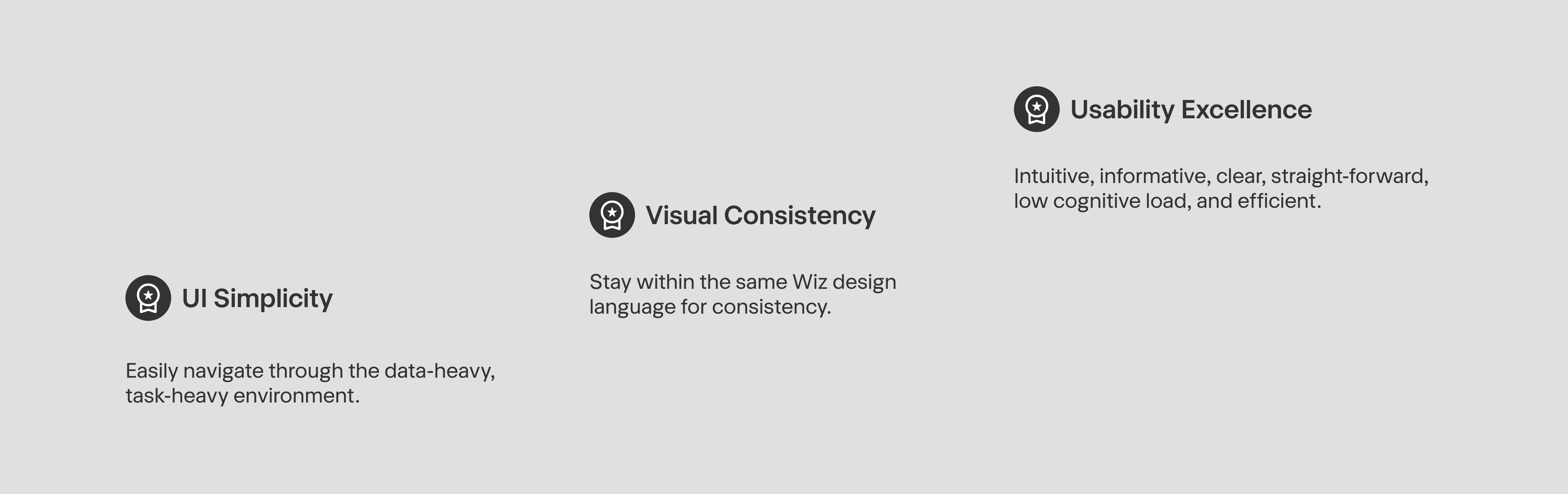
The target users for the new product shifted from students to busy admin staff. Based on the interviews with the existing admin team, we learned that the initial painpoints are in these areas:
Visual Simplicity
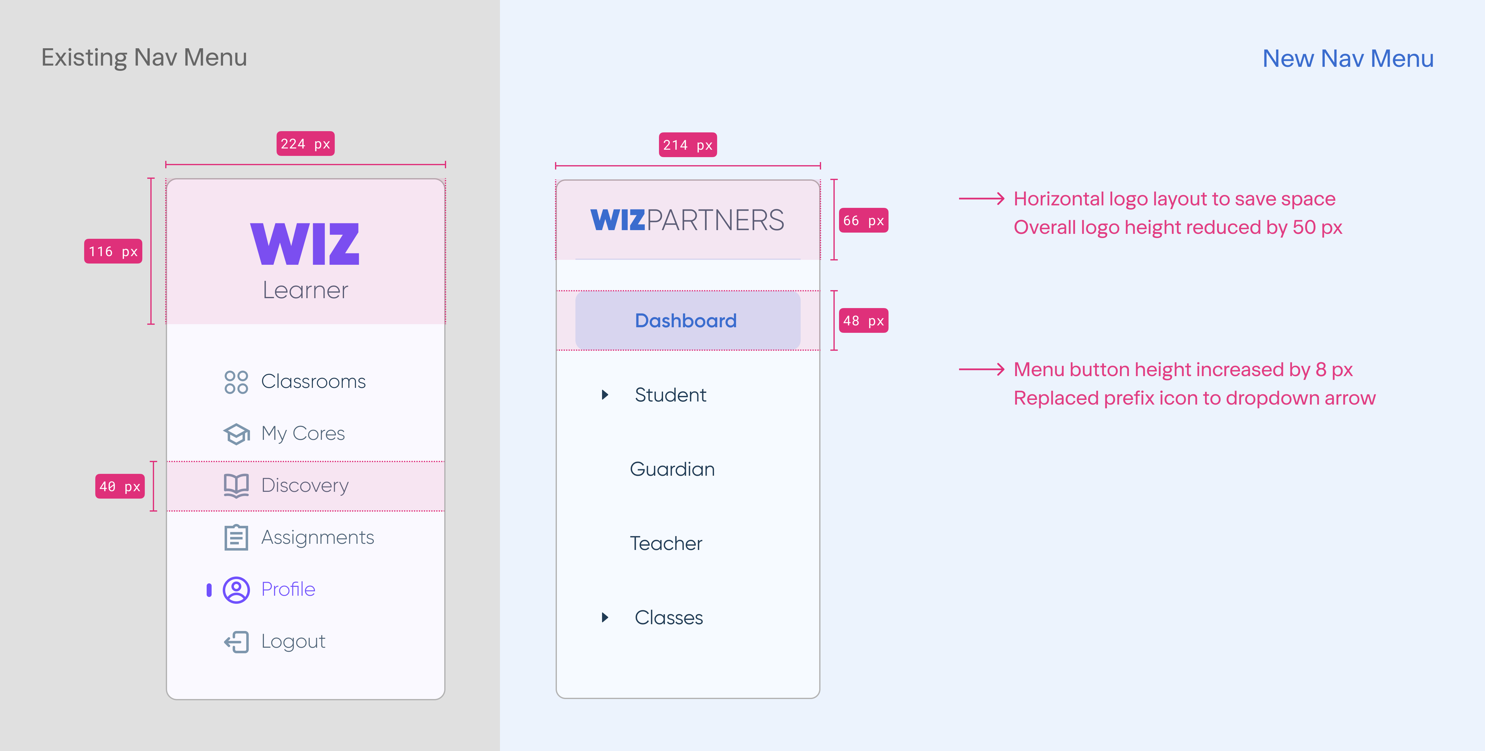
Step 1: Navigation Bar Clean-up
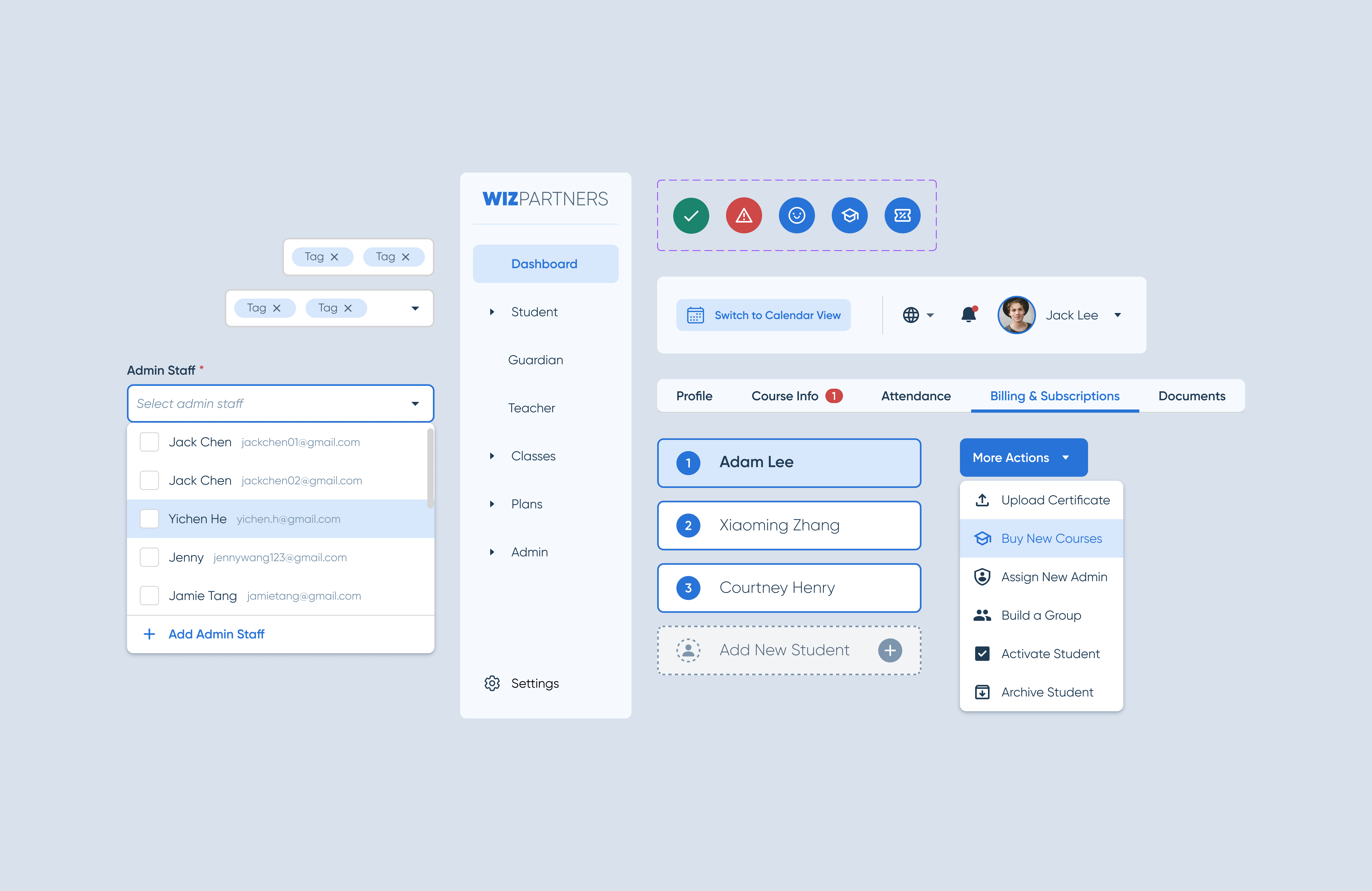
Reduced the logo size and gave the square footage back to the navigation bar for more functionalities. Replaced icons with dropdown icons to accommodate sub-menu titles according to the information architecture map.
Visual Simplicity
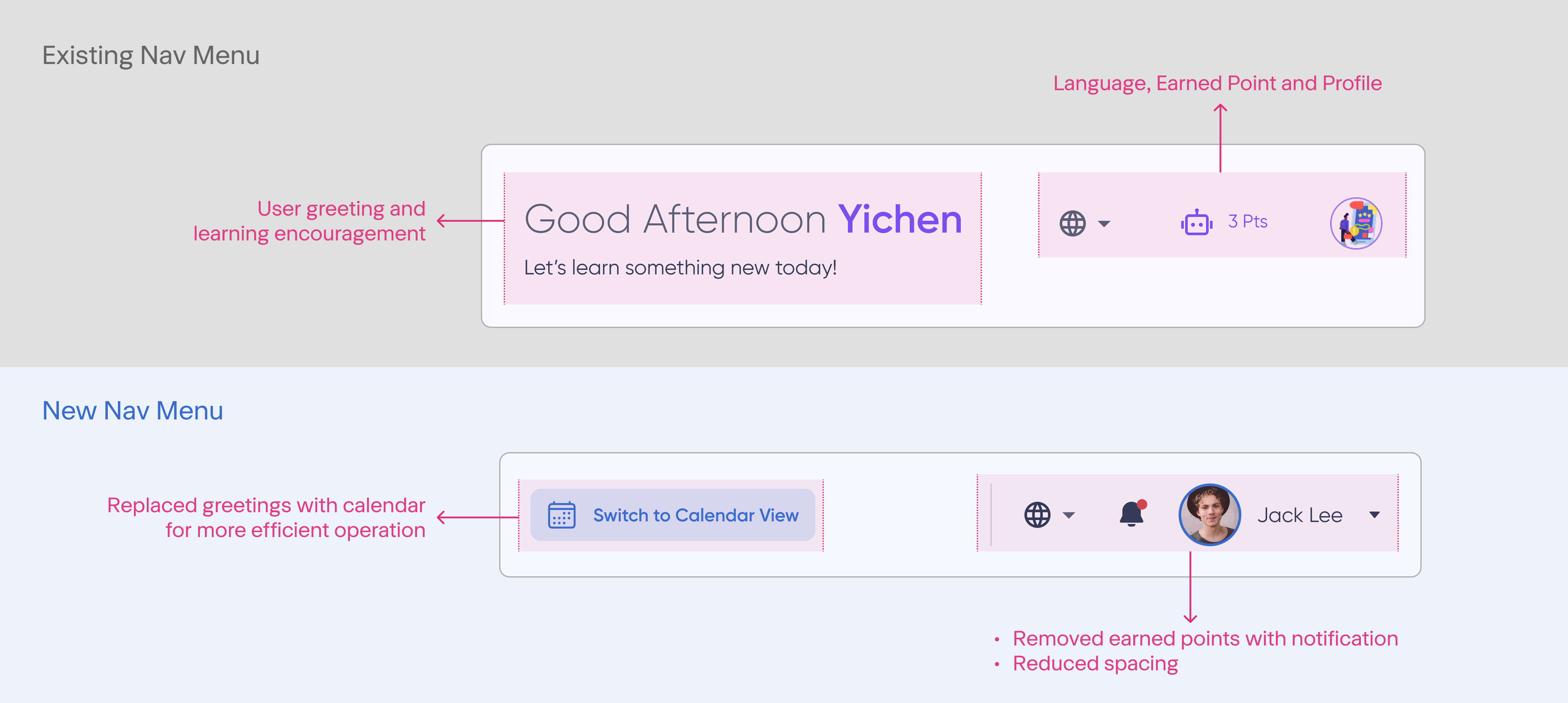
Step 1: Top Menu Clean-up
Replaced user greetings with a more critical feature - calendar view - and to stay on top of the task-oriented approach. The language button stayed as we have a large number of Chinese users and replaced the class point icon with a notification to keep users informed at all times. Profile dropdown for any setting features we will need.
Visual Simplicity
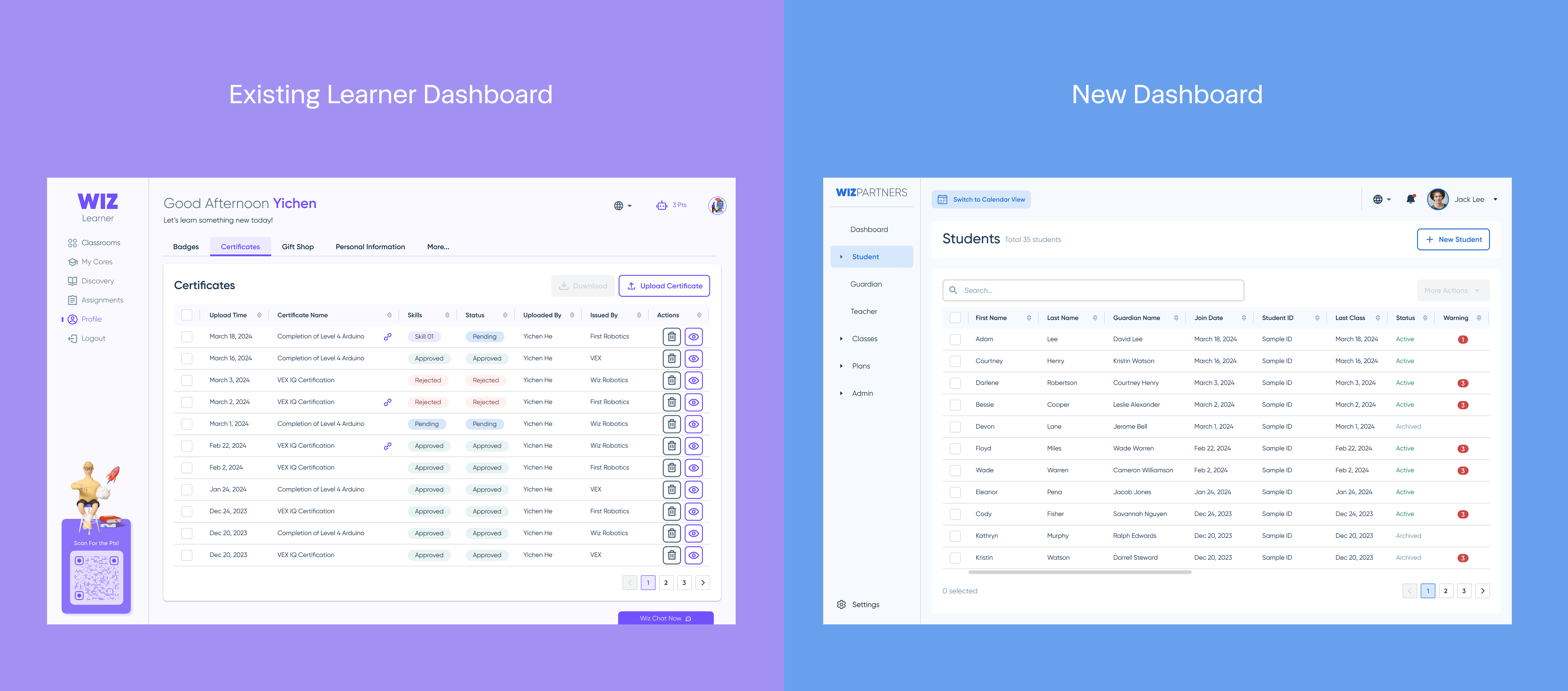
Step 1: Ensure brand consistency
I kept the same dashboard layout, information architecture and most of the button styles to maintain visual consistency with the existing Wiz products.
UI Anatomy
Usability Excellent
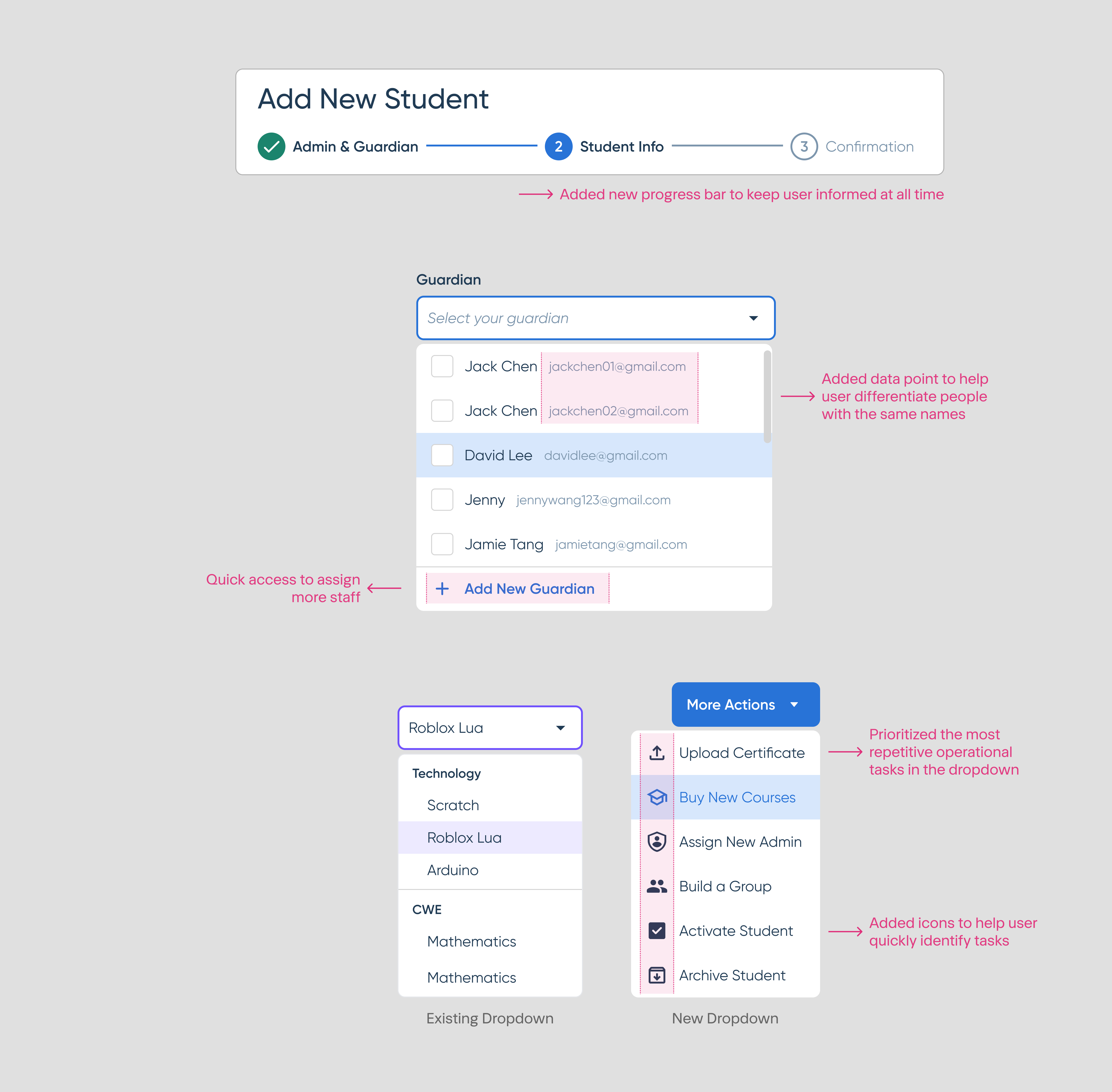
A few UI upgrades lead to usability excellence.
- Most wanted tasks all in one dropdown.
Through the early user interviews, I narrowed down the most repetitive tasks that admin needs to have immediate access to. The data prioritized dropdown helps user stay efficient and accurate to perform tasks.
- Progress Bar is simple, but not thought of.
A clear progress bar with visual cues brings clarity to all users, especially the elderly user.
- Looks-redundant-but-actually-not data point display.
One unique situation I learned from user interviews is that a few customers and staff have the same first and last name. To differentiate people and avoid confusion, I added their emails as hint notes on the dropdown menu to help the user.
Project Takeaways
Don’t reinvent the wheel, but personalize for the needs
It’s a no brainer for me to build the new B2B library based on the existing B2C library. However, keep my target user in mind at all time and personalized certain details is the upgrade.
Stay agile, develop along the way
The small team moved pretty fast, I cannot create all the components after I spend time for the cohesive view of the future state of the product. So I released components incrementally and stayed close with the dev team to ensure we are on the same page.