
Wiz Partners
Manage chaotic school admin work at ease.
Role
Product Designer
Client
Wiz Robotics
Timeline
March - June 2024
Responsibilities
From B2C to B2B rapid revamped
With an outdated CRM dashboard and a handful of needs being met, Wiz Robotics, a school that helps students with STEM, was losing valuable new customers and profit.
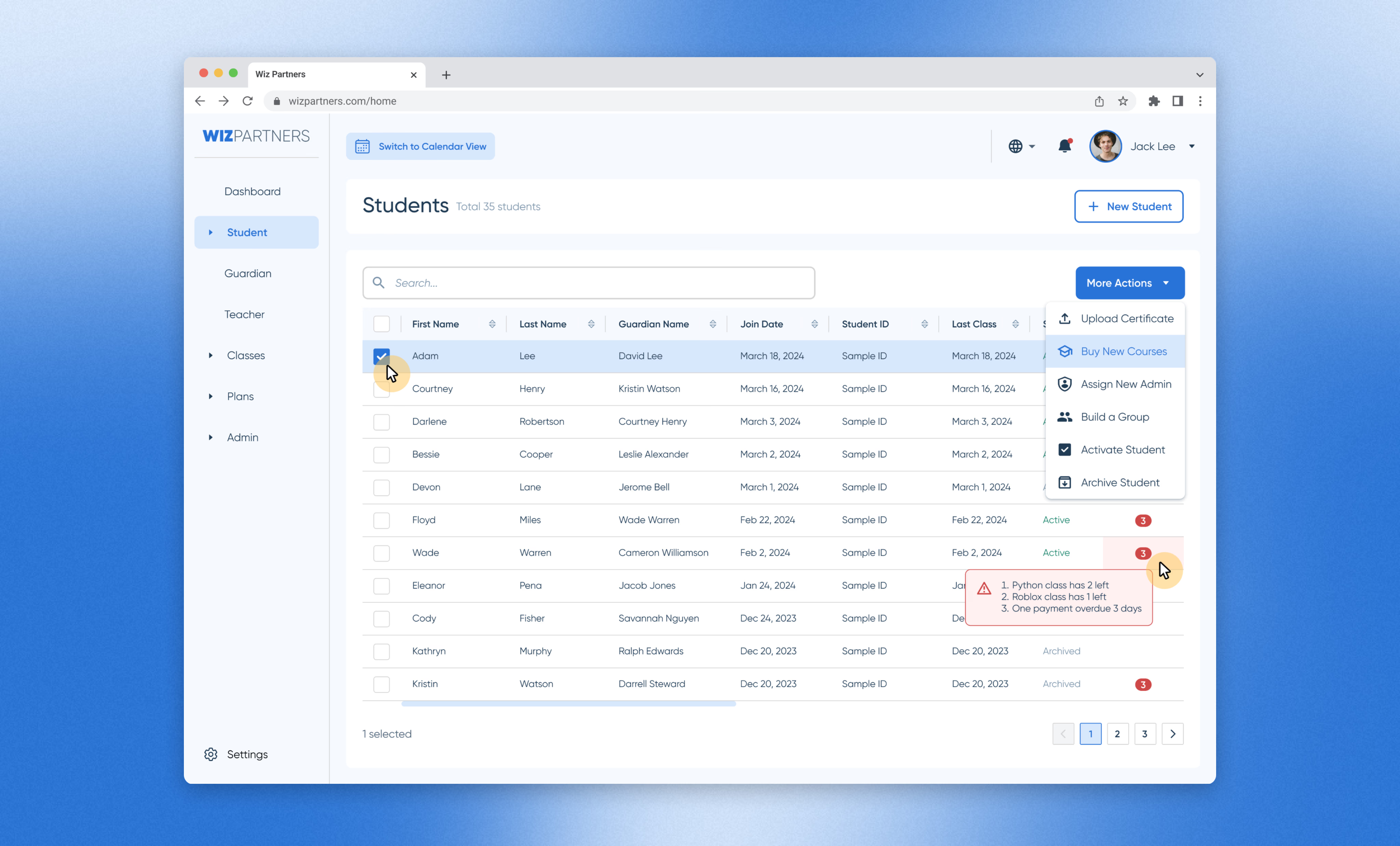
To flip the narratives, Wiz elevated the dashboard by revamping workflows, modernizing UIs and reimagining how they want to grow big. The result is a beautiful and effective CRM dashboard that is both easy to manage and helps staff to get work done. The product has its own name within the Wiz ecosystem - Wiz Partners.
ONE
Tool for all admin operations
+45%
Increase in user efficiency
+7%
Increased in user efficiency
Outdated tool does not empower the fast-growing business
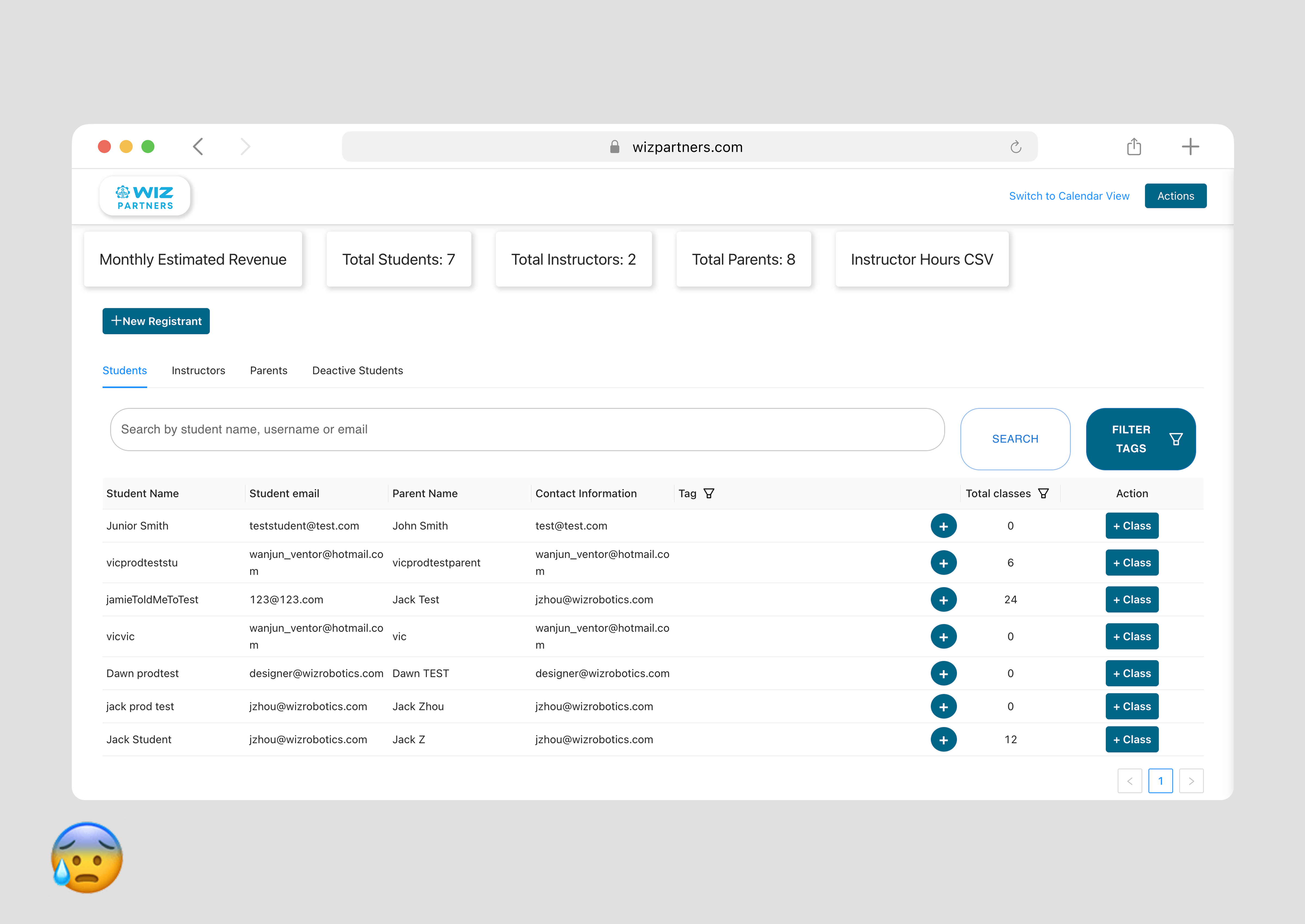
Wiz’s business is booming, attracting many new customers. However, the outdated tool is neither keeping up with the business's growth nor meeting the admin team’s needs to onboard or convert new customers efficiently.
Business Problem
Outdated dashboard does not support growth
Disorganized user flows
Lack of features and data points
Outdated UI library
User Problem
Lack of efficiency to streamline admin work
Disorganized user data
Still rely on paper, Excel sheet and manual labor
Lack of automation
The 1st Challenge
How to manage school admin work at ease and drive sales?
Design Strategy
Prioritize Workflows for Conversion
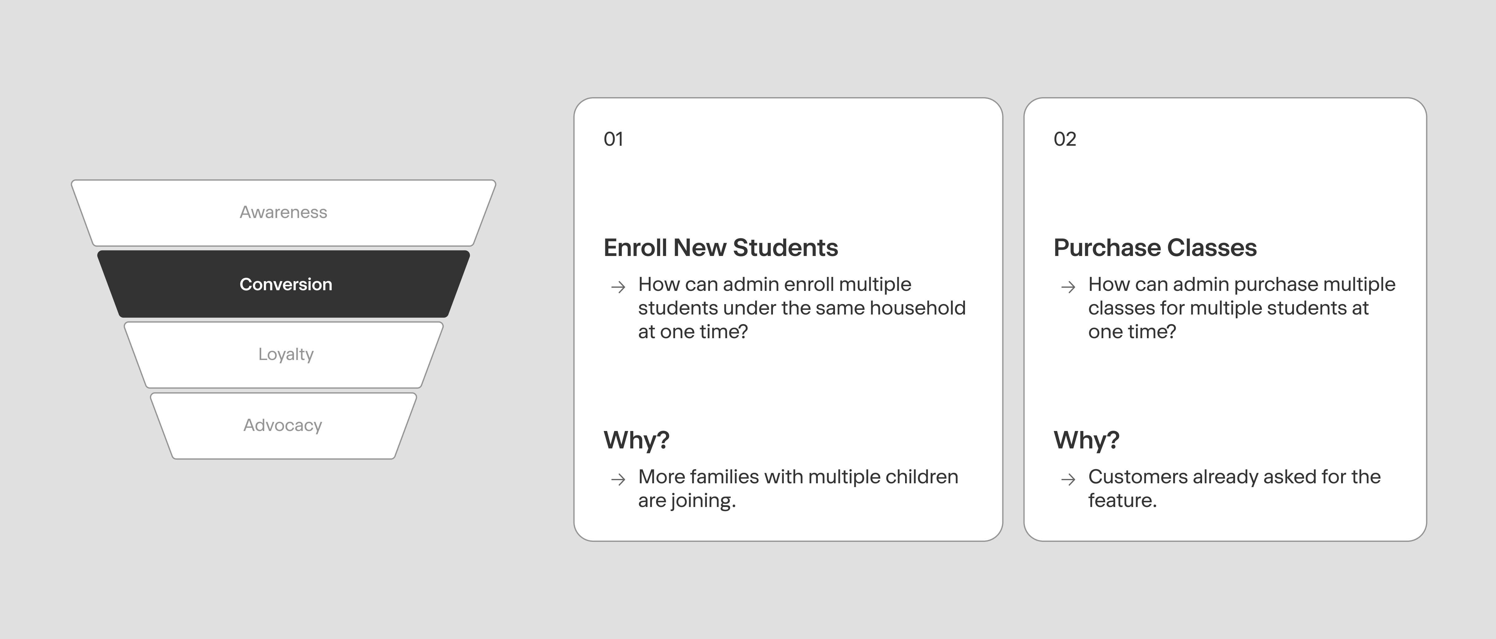
After speaking with the owner and the admin team, I quickly zeroed in on the workflows that mattered most: getting new students successfully registered, then helping them purchase the right classes. These two steps form the critical path of the conversion funnel — by fixing them first, Wiz could convert new customers in the shortest time possible and stop valuable leads from slipping away.
Understand the Problem Space
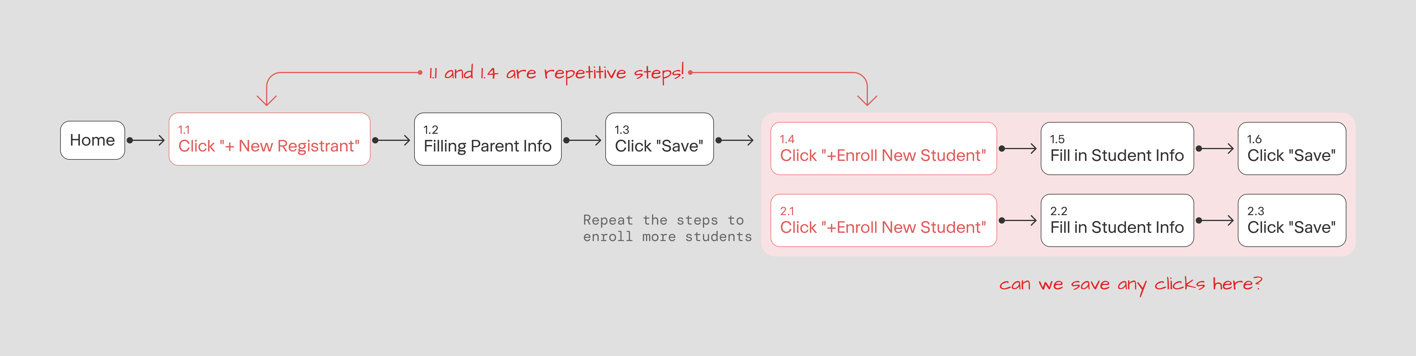
Current enrollment flow has multiple blocks
Stress-testing the existing workflow is the best way to uncover where the real optimization opportunities lie — and a key lever for improving the admin team’s efficiency. Walking through the current enrollment flow step by step exposed exactly where time and clicks were being wasted.
Design Process
Step 1: Reimagine user’s first view
The first step was to sit down with the actual admin user and talk about what data points they want to see from the operational perspective, and understand why they want to see, also what do they do about it.
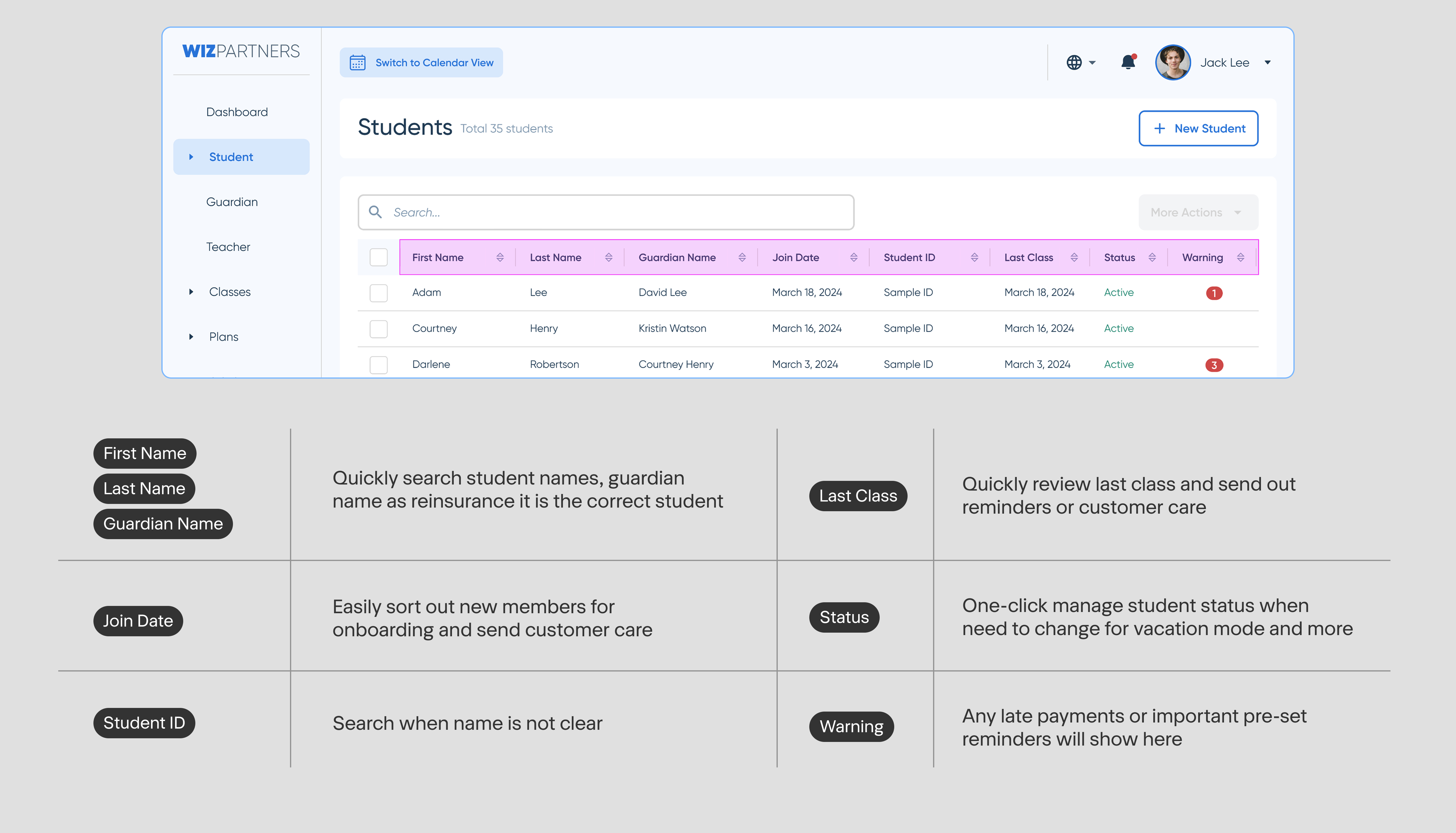
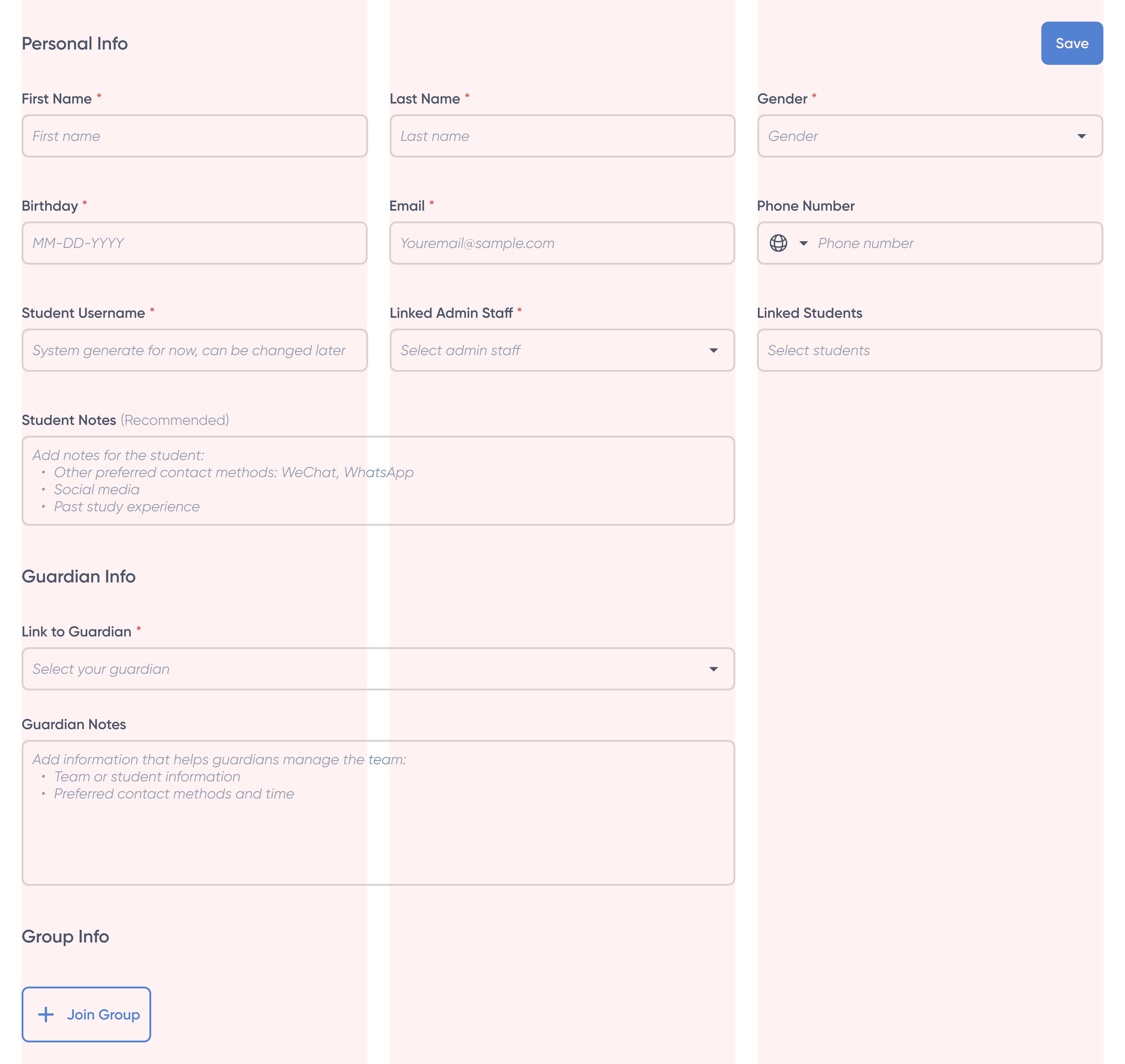
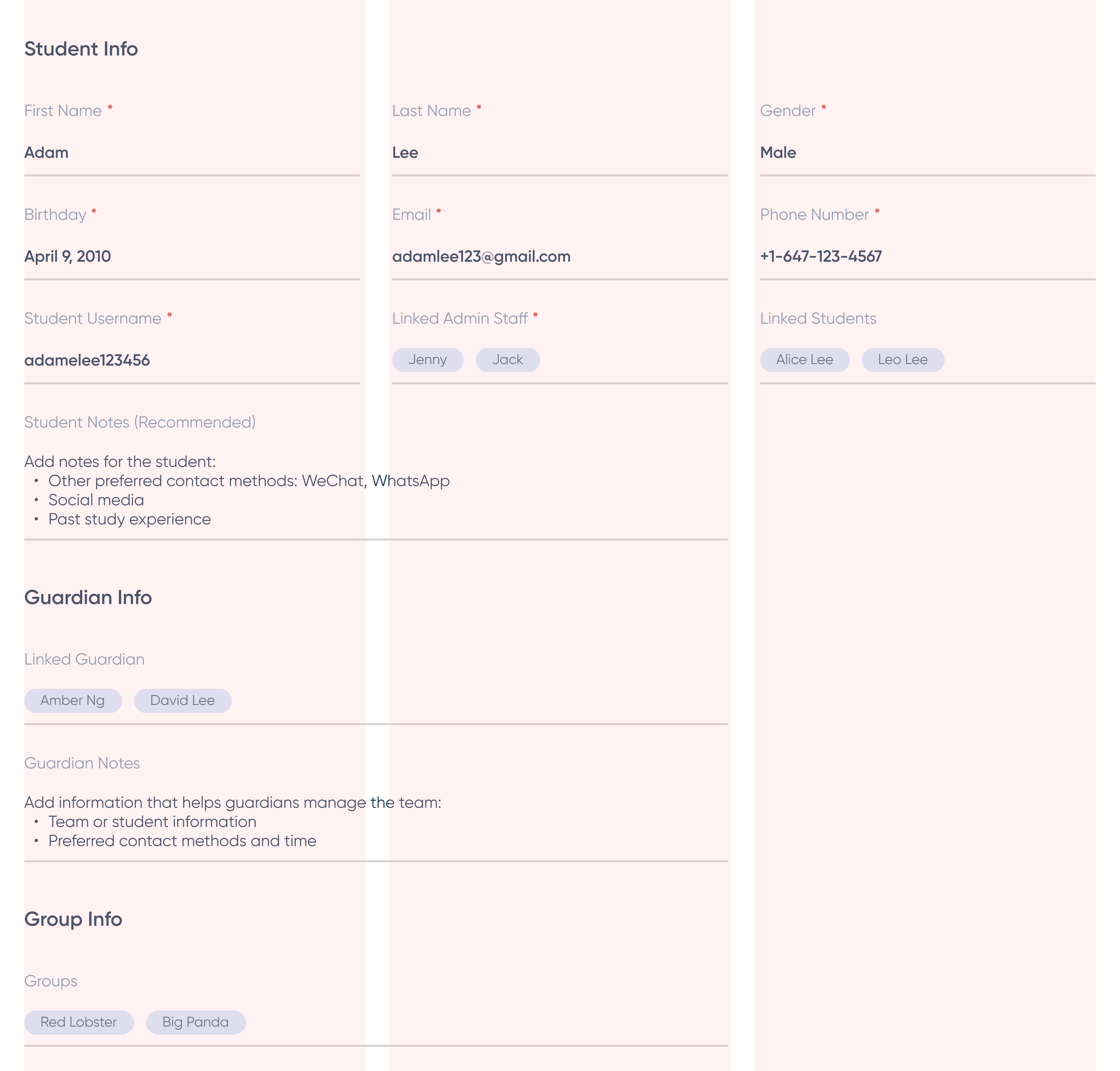
Working from the essentials the admin user shared, we ranked every data point by priority and built the form in two states — edit and saved — laying the foundation for the student enrollment form.
Design Process
Step 2: Map out new workflow in low-fi
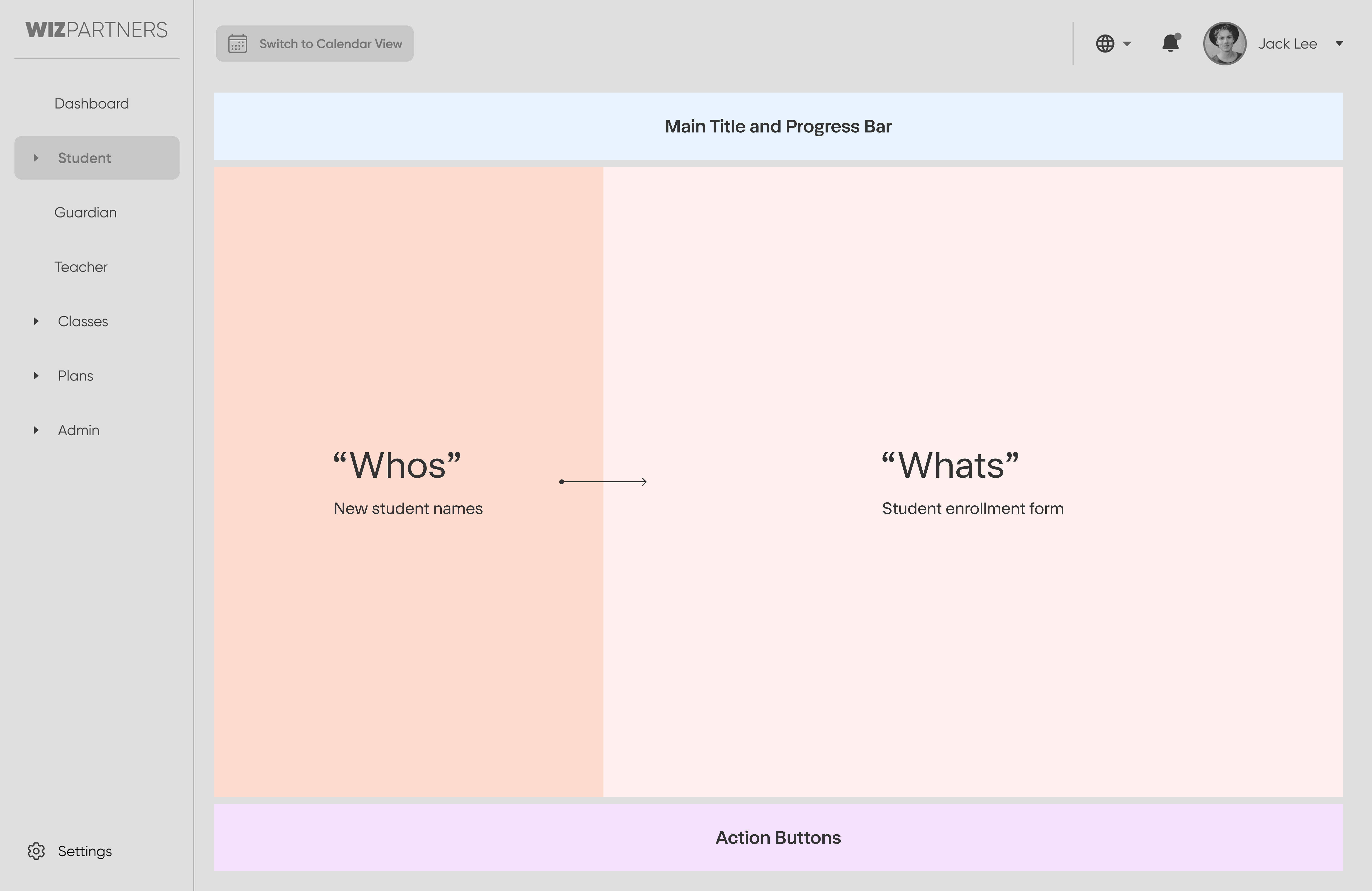
Learned from the usability testing and the reimagined new dashboard, a new enrollment workflow was created effortlessly.

The highlighted painpoint here which is the key to help admin user to maintain efficiency while enrolling new students from the same household in a busy environment. Keep the “Who” and “What” separated in a 2 column format helps user reduce cognitive load while filling in info.
Design Process
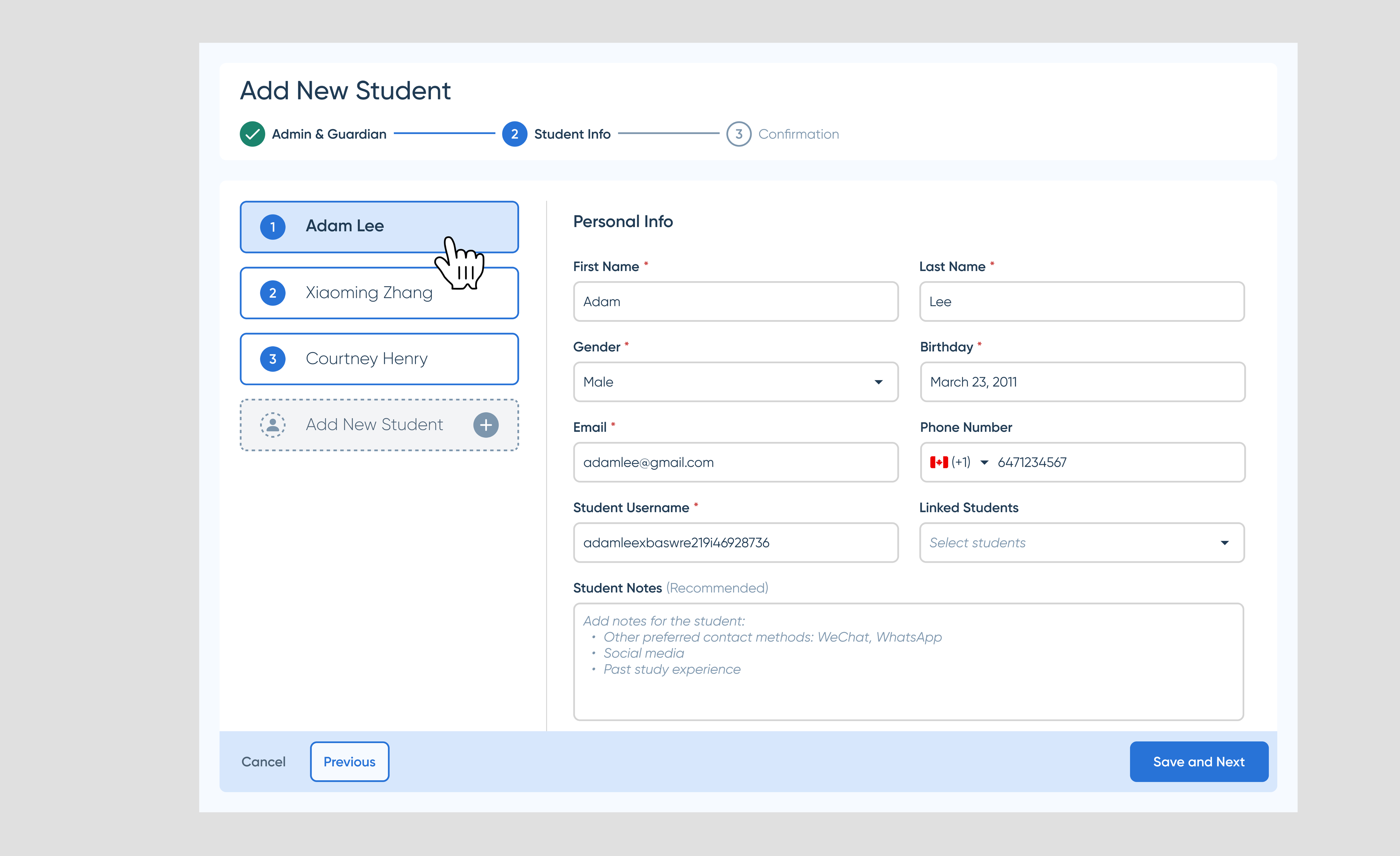
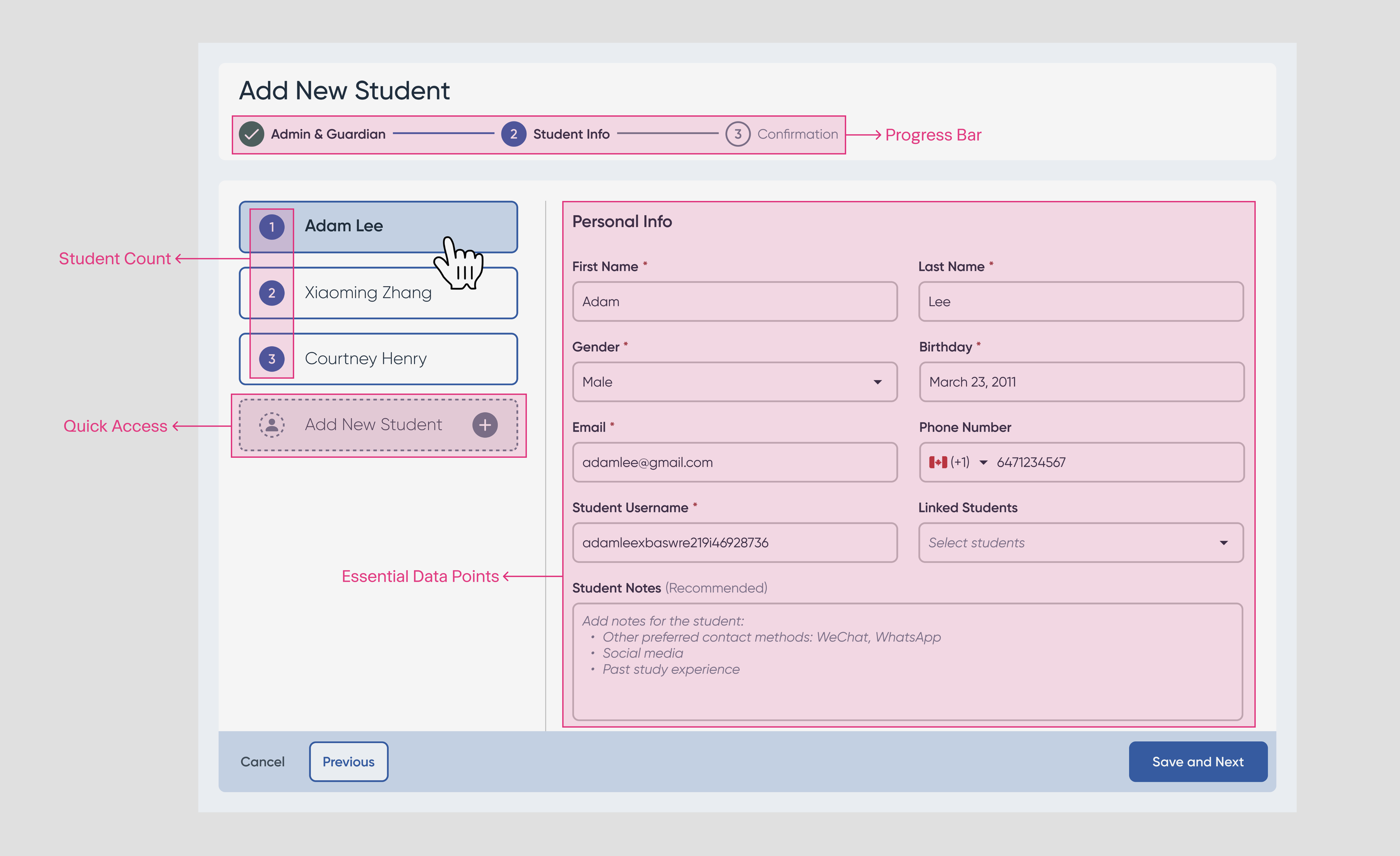
Step 3: Hi-fi UI Anatomy
Dropped in the components from our library, ensure the stepper is enabled. Voila, we got our new enrollment form.
The 2nd Challenge
How to convert new customers into paid customers?
Painpoint: Purchase Classes for Multiple
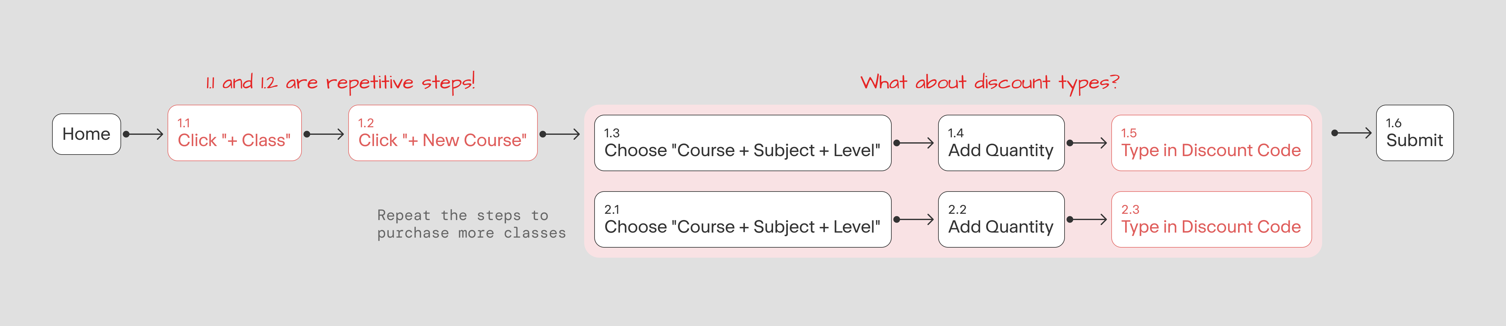
Current purchase flow has multiple blocks
Stress-testing the existing workflow is the best way to uncover where the real optimization opportunities lie — and a key lever for improving the admin team’s efficiency. Walking through the current enrollment flow step by step exposed exactly where time and clicks were being wasted.
Design Process
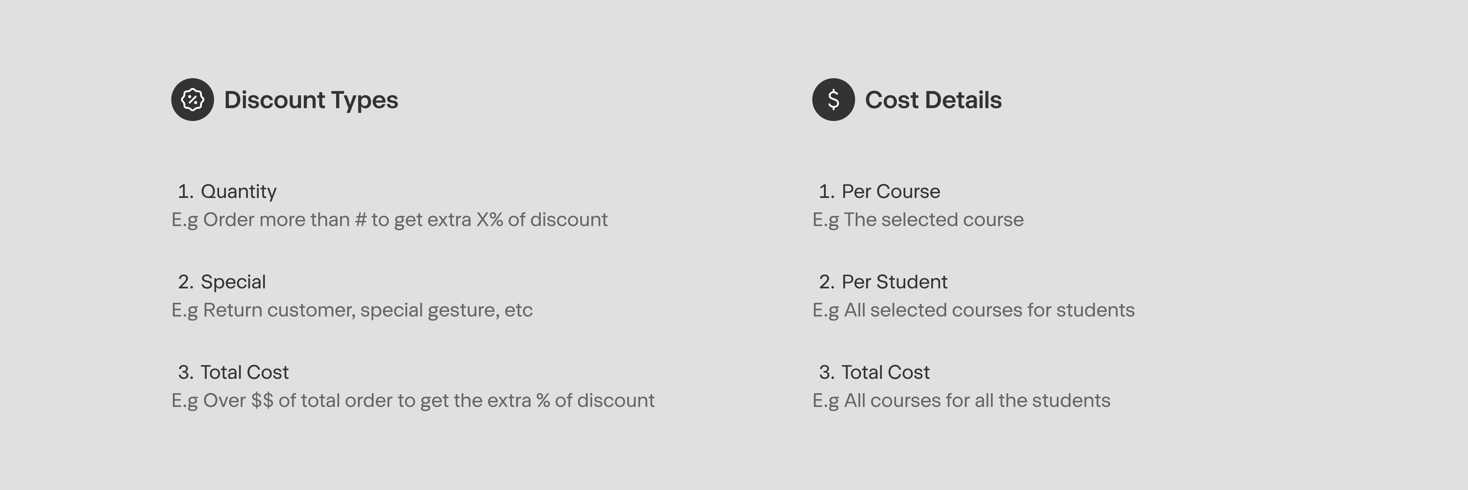
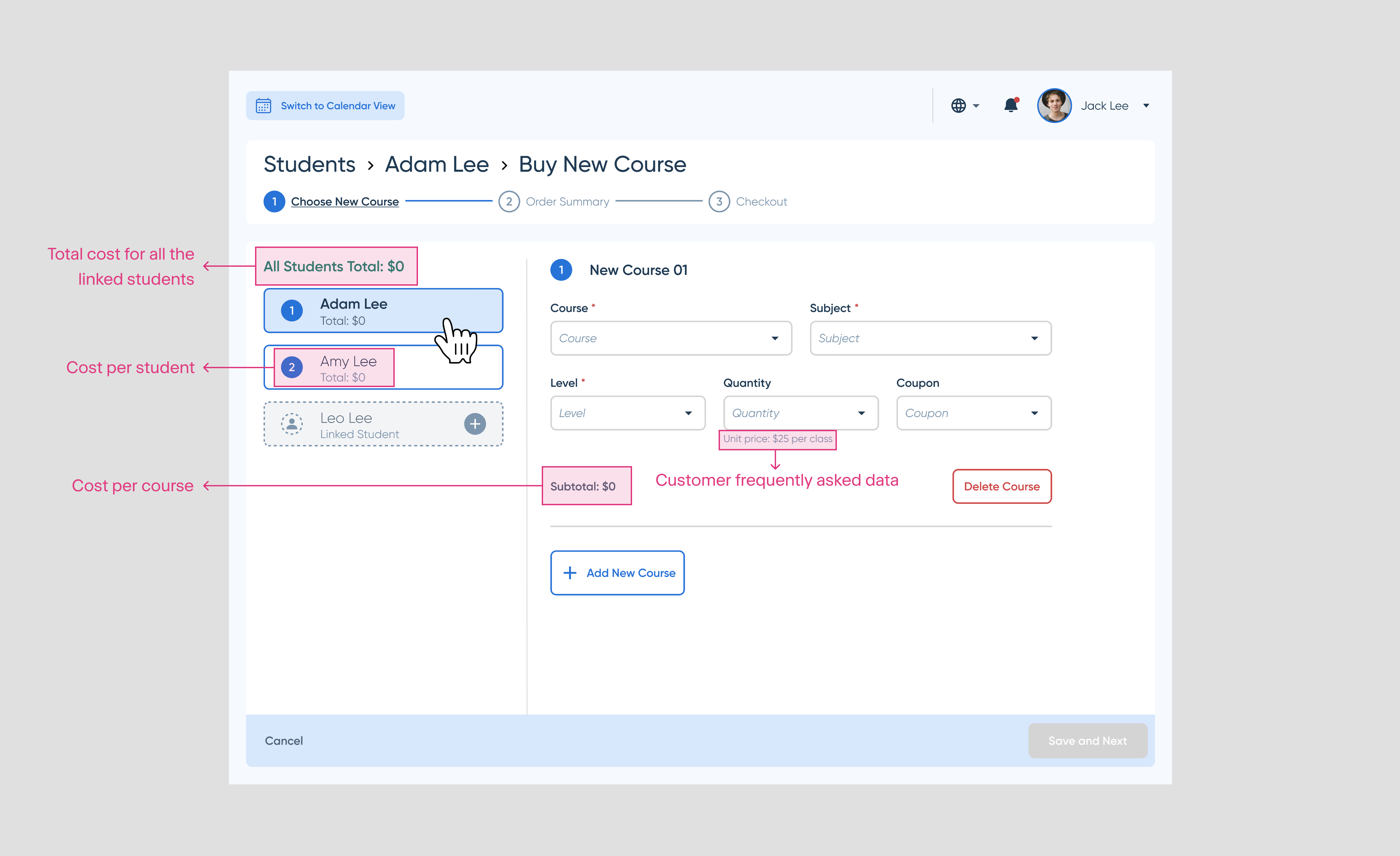
Step 1: Identify important money data
Collected the most important data points from the admin team, mapped out the different use cases and priority levels.
Painpoint: Purchase Classes for Multiple
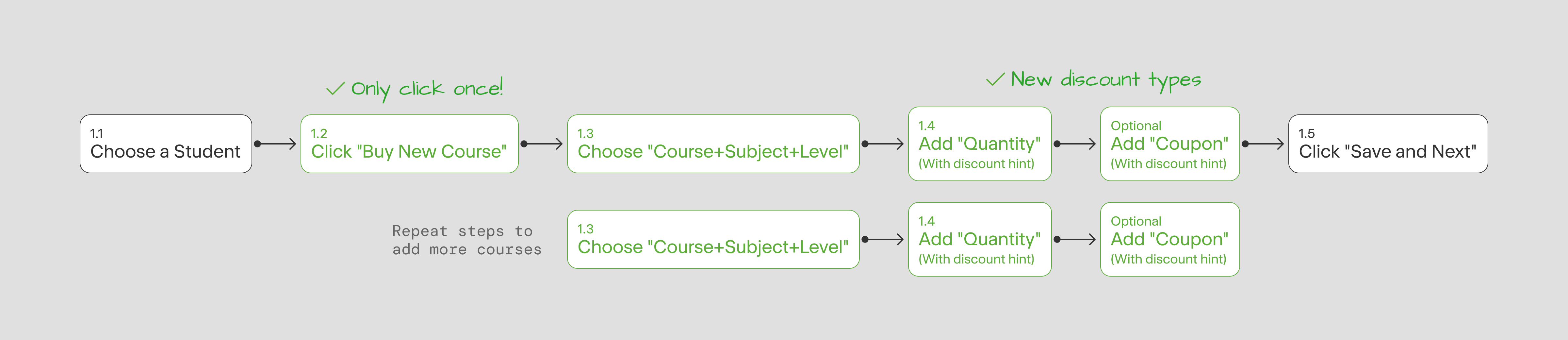
Step 2: New User Journey Exploration
Buy, buy what, how many, here is your discount, and done.
Painpoint: Purchase Classes for Multiple
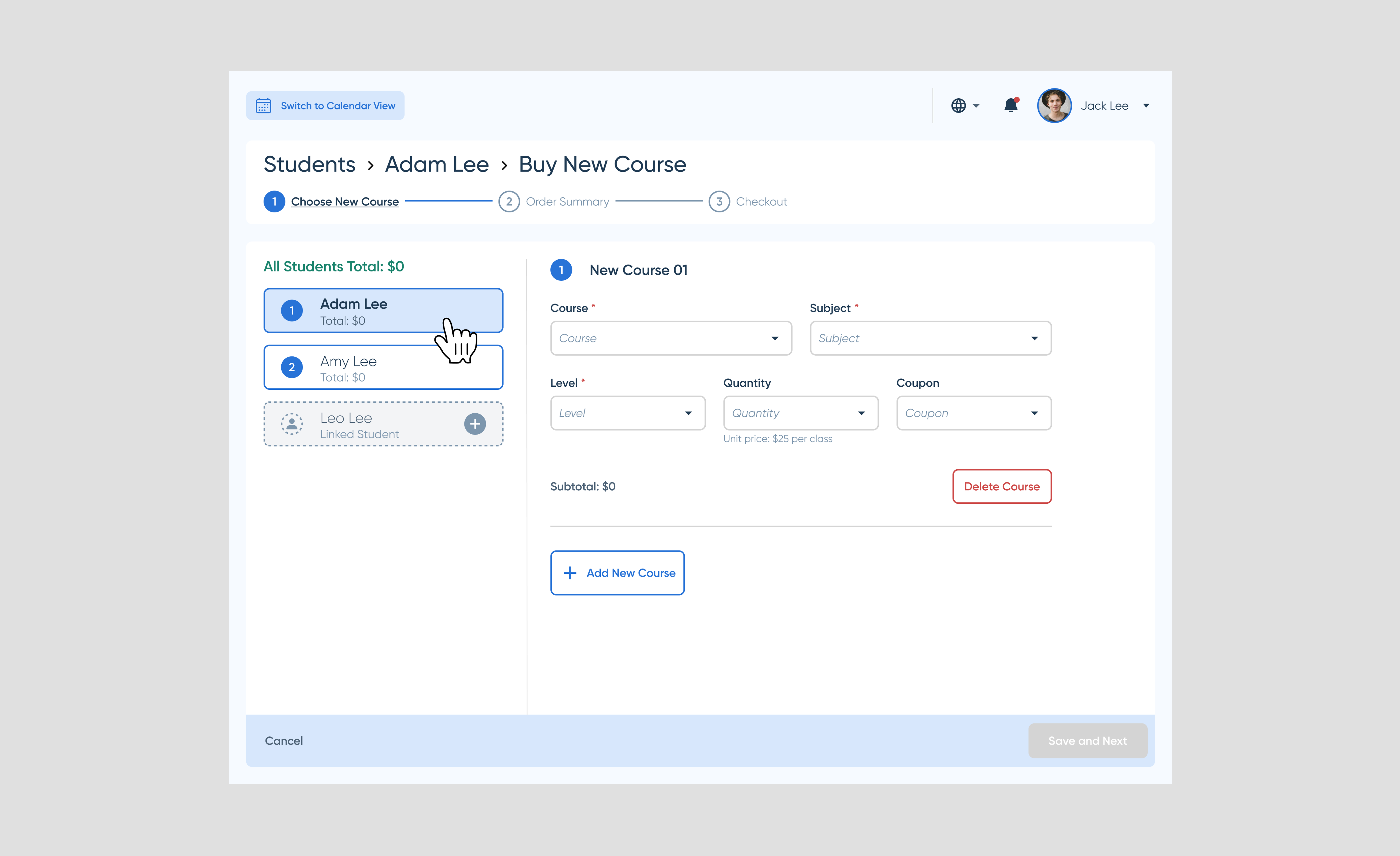
Step 3: Hi-fi UI Anatomy
Buy, buy what, how many, here is your discount, and done.
Project Takeaways
User vs. Customer
The “Admin” is the user I designed for, but the Students/Parents are our “Customers”. Differences between these two personas helped me be mindful and be empathetic for different goals.
Be mindful to connect dots
While working on 7-8 workflows simultaneously and to innovate workflows, being empathetic with the user and the customers helped me to be in “character” and connect the dots intuitively.
Leverage existing resources
The existing design system helped me go from 0 to 1 quickly. I also leveraged Google Materials Library which saved a tremendous amount of time to create new components.
Open communication
We were lucky to work in a small team that was easy to book meetings to share ideas and insights from all directions. It helped us to be mindful of other’s work from the very beginning.