Wiz Design System
Revamped new theme from B2C to B2B
MY ROLE
Product Designer
ACTIVITY
Design System
CLIENT
Wiz Robotics
TIMELINE
March - June, 2024
TEAM
Yichen He, Design Advisor
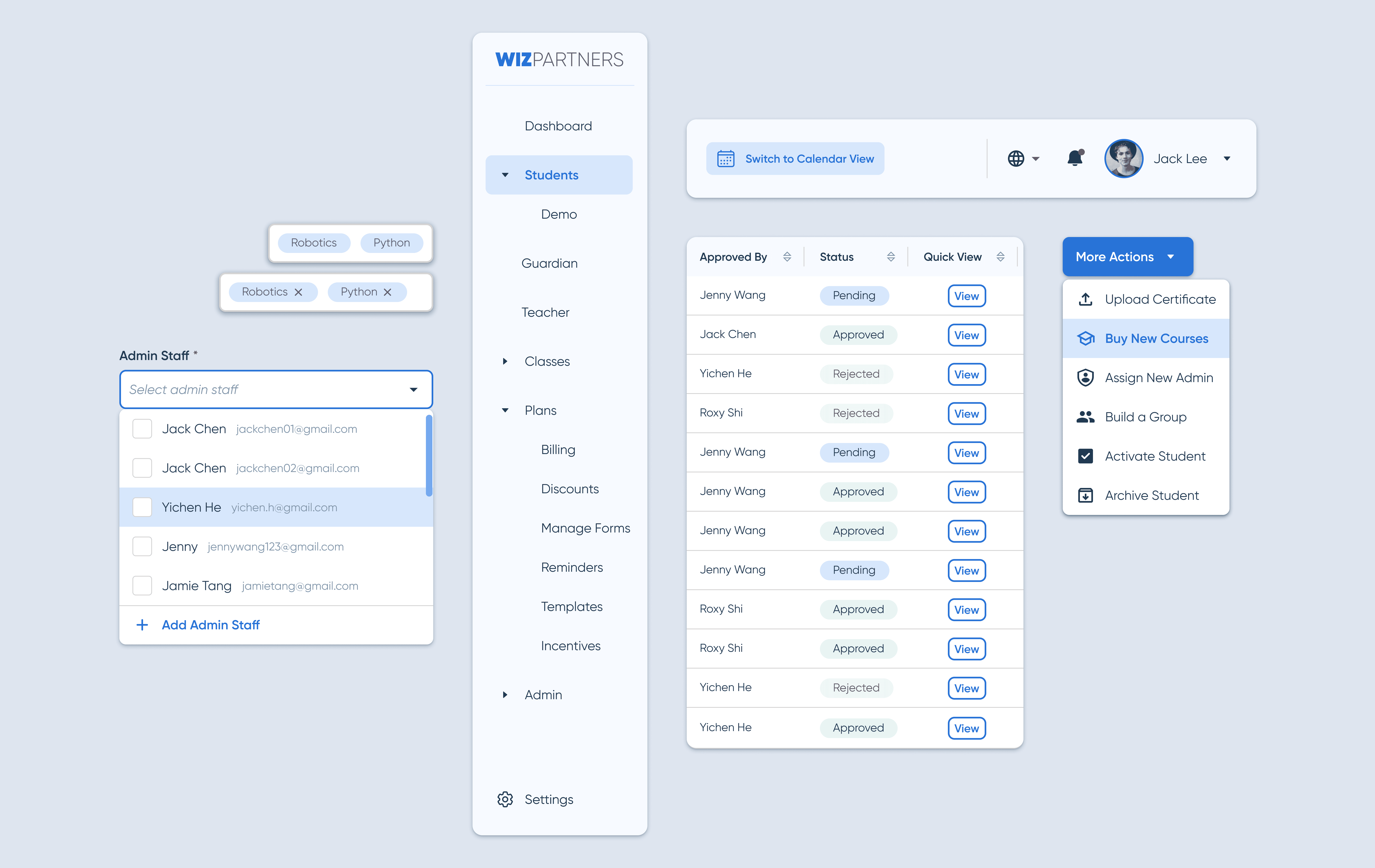
To elevate the outdated dashboard of Wiz Partners, I took the opportunity to revamp the existing design system and created a composable UI library that suits the B2B environment. The visual language is consistent with other existing products within the Wiz ecosystem and can be easily transformed to meet our future needs.
/ DESIGN AUTDIT
What do we already have?
I conducted an heuristic audit of the existing Wiz Partner interface to understand design issues and collected user feedback and painpoints.
The dated interface only serves the user the basic functionalities and requires manual work: take notes on paper and Excel sheets.
I decided to design the whole information architecture and product from scratch to save time, instead of redesigning.
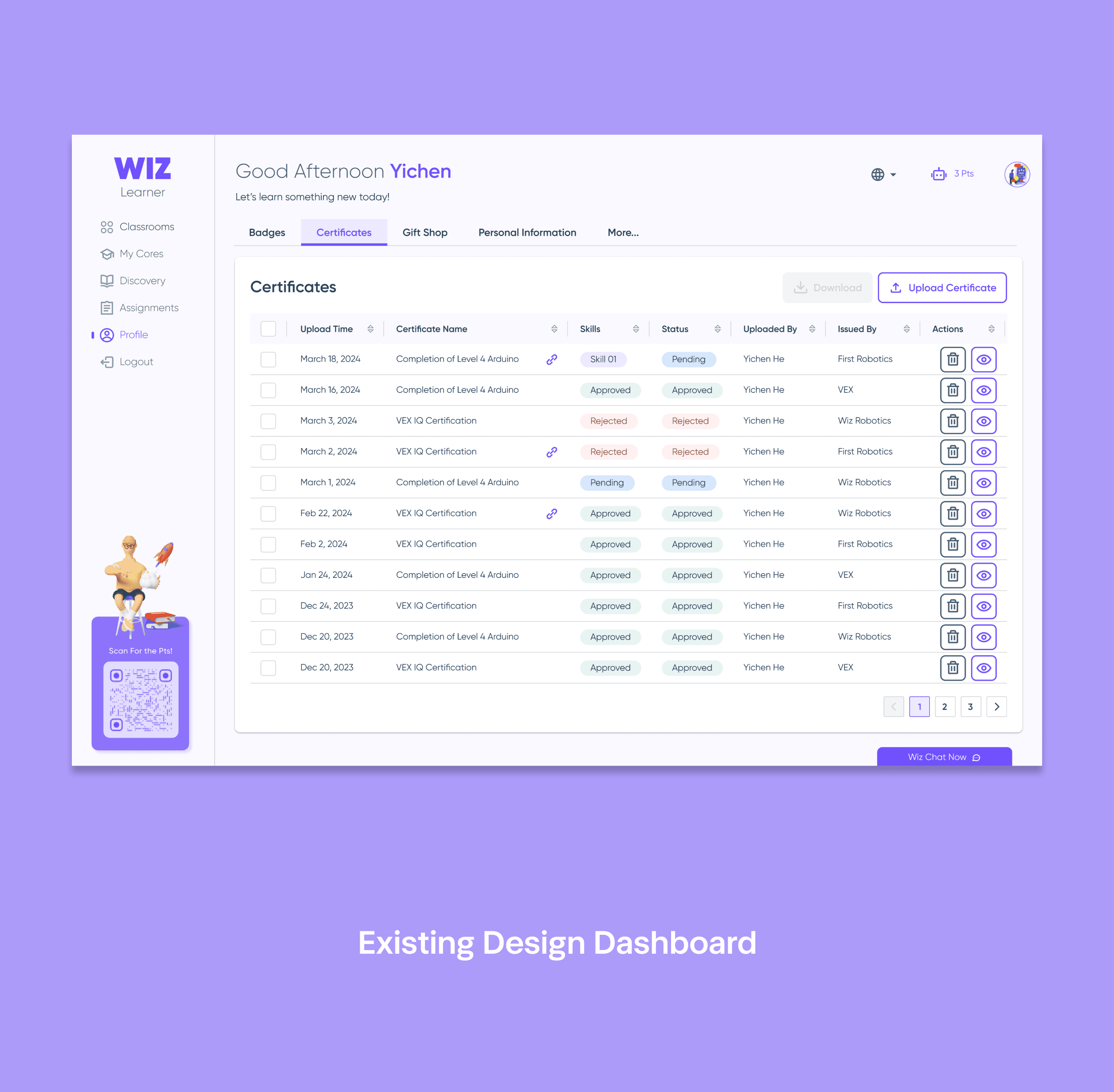
Previous Wiz Partners Platform
Image
What else?
The recently updated product Wiz Learner has a more mature design system for me to leverage. The PM and the owner also expressed that this is the new visual standard and style we are carrying forward.
As the Wiz Learner was designed mainly for students, I was still able to identify elements and components to carry forward for evolvement:
Previous Wiz Partners Platform
Image
/ DESIGN STANFARD
New Primary Colors
After the team decided to use Blue as the new primary color to bring in calmness and professionalism, we generated different shades to kick off the design process.
#1754A6
#2873D7
#73AAF4
#D7E7FC
#F6FAFF
/ DESIGN STRATEGY
What to be mindful?
The target users for the new product shifted from students to busy admin staff. Based on the interviews with the existing admin team, we learned that the initial painpoints are in these areas:

Data Heavy
Large database of existing and new customers, and their accounts to deal with.

Task Heavy
Go-to platform for all the daily operational tasks for both front-end and back-end.

Low Tech-savvy Users
Low tech-savvy users are part of the existing user group that would require easy and intuitive design.
/ DESIGN PRINCIPLES
North Star Design Principles

UI Simplicity
Easily navigate through the data-heavy, task-heavy environment.

Visual Consistency
Stay within the same Wiz design language for consistency.

Usability Excellence
Intuitive, clear, straight forward, accessible and efficient.
/ UI ANATOMY
Visual Simplicity
Step 1: Navigation Bar Clean-up
Reduced the logo size and gave the square footage back to the navigation bar for more functionalities. Replaced icons with dropdown icons to accommodate sub-menu titles according to the information architecture map.
Navigation Bar Clean-up Comparison
Image
Step 2: Top Menu Bar Clean-up
Replaced user greetings with a more critical feature - calendar view - and to stay on top of the task-oriented approach. The language button stayed as we have a large number of Chinese users and replaced the class point icon with a notification to keep users informed at all times. Profile dropdown for any setting features we will need.
Top Menu Bar Clean-up Comparison
Image
/ UI ANATOMY
Visual Consistency
I kept the same dashboard layout, information architecture and most of the button styles to maintain visual consistency with the existing Wiz products.
Dashboards Comparison
Image
/ UI ANATOMY
Usability Excellence
Through the early user interviews, I was able to narrow down some repetitive tasks that the admin wanted to perform without going into any detail pages.
Smarter Dropdown Menu
A smarter dropdown menu that contains the essential features with visual cues would help the user speed up the process to get repetitive tasks out of the way as fast as they can.
Dropdown Menu Comparison
Image
New Progress Bar
A clear progress bar with visual cues brings clarity to all users, especially the more senior ones and keep them informed where they are at while registering forms.
New Progress Bar
Image
Detailed Dropdown List
One unique situation I learned from user interviews is that a few customers and staff have the same first and last name. To differentiate people and avoid confusion, I added their emails as hint notes on the dropdown menu to help the user.
Staff List Dropdown Menu
Image
/ FINAL DESIGN
The New Library
Besides all the new adjustments and creating, I was efficient in converting modular existing components into the new theme by changing the color from purple to blue.
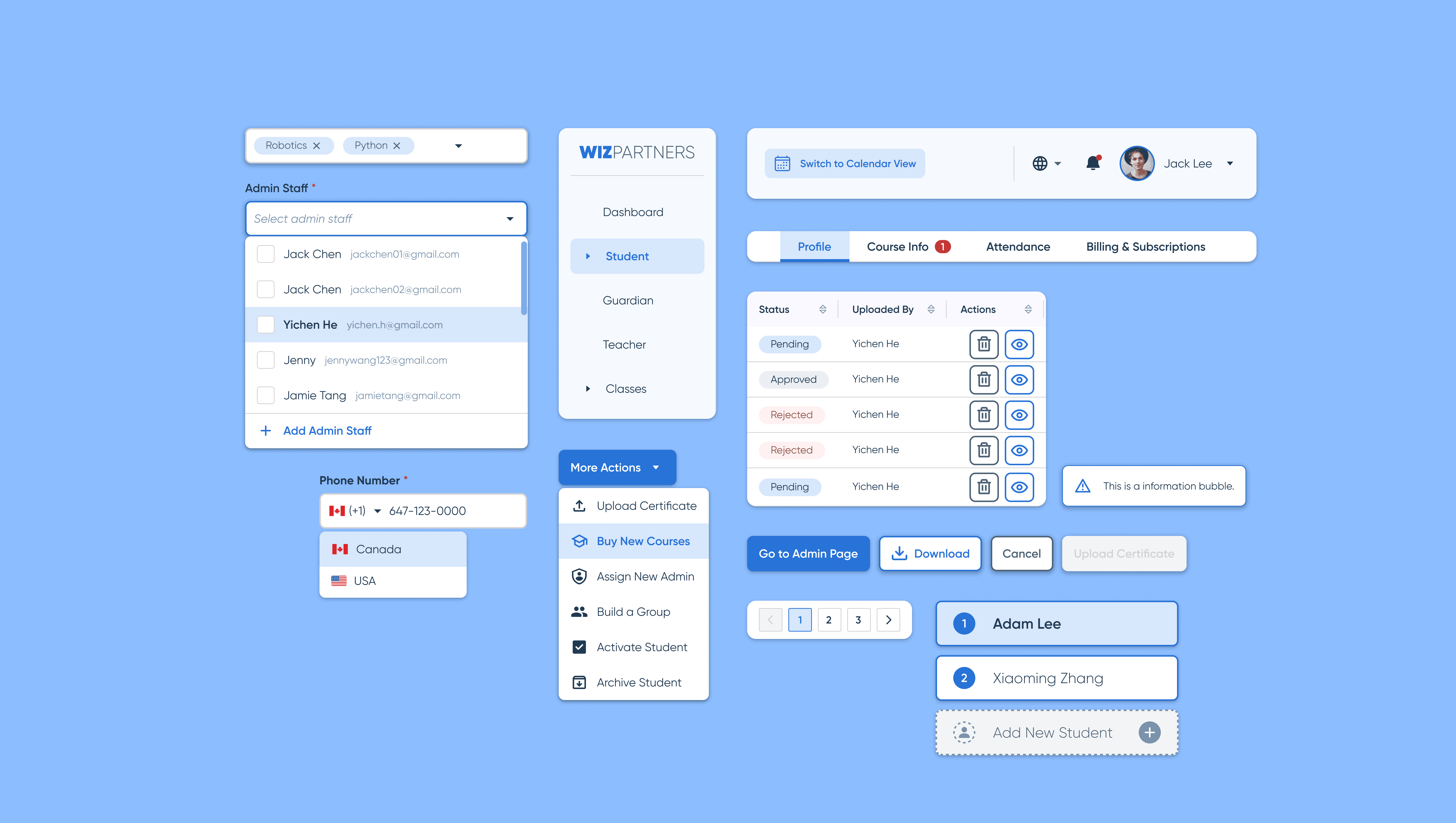
Through working with the team on the new workflows, I created more brand-new components. Here are some old and new examples:
New Components Overview
Image
/ RESTROSPECTIVES
Project Takeaways

Leverage existing resources
Spend time to get familiar with the design library helped me to connect dots, generate creative ideas and be efficient in pulling the right components when needed.

Get familiar with the library
Gain a better understanding of the overall condition before connecting dots, generating creative ideas, and efficiently pulling the right components when needed.

MVP Mindset
Get the mid-fi components out for functionality testing is more important than building pixel-perfect components at early stage.


